Hi, my name is
Peter OttoKuhberg
I prototype to think, and build to understand the world around me.
About Me
I'm a prototyper, problem-solver, and self-taught developer with a background in Communication and Interaction Design. More than anything, I'm endlessly curious about how things work digitally, physically and mechanically
Whether it's our coffee machine, an app, or my son's duplo train, I can't help but take it apart, and figure out how it ticks. This mindset shapes my work. I design through building and I build to learn.
I'm at my best when exploring messy problems, testing ideas quickly, and learning by doing. I'm not afraid of not knowing. I'll happily dive into research, new tools, or entire ecosystems to get to the heart of a challenge.
I've prototyped physical products, built digital tools, designed complex systems, and written code to bring it all together. I care deeply about clarity, elegance, and momentum. I believe that playful ideas can solve serious problems.
Outside of work, I'm the person friends call when something breaks, needs to be built, or just doesn't make sense. I take that as a compliment.
Peter Bot
Personal Project
2025
The whole shabang
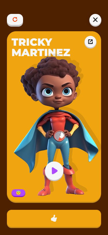
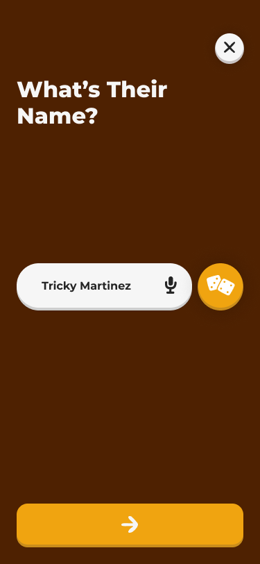
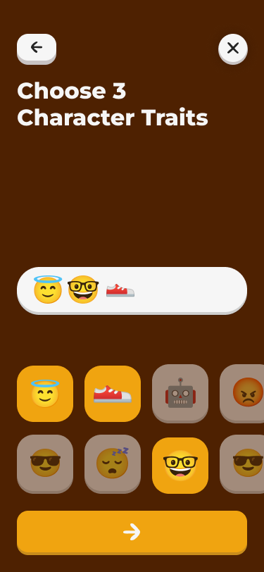
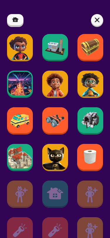
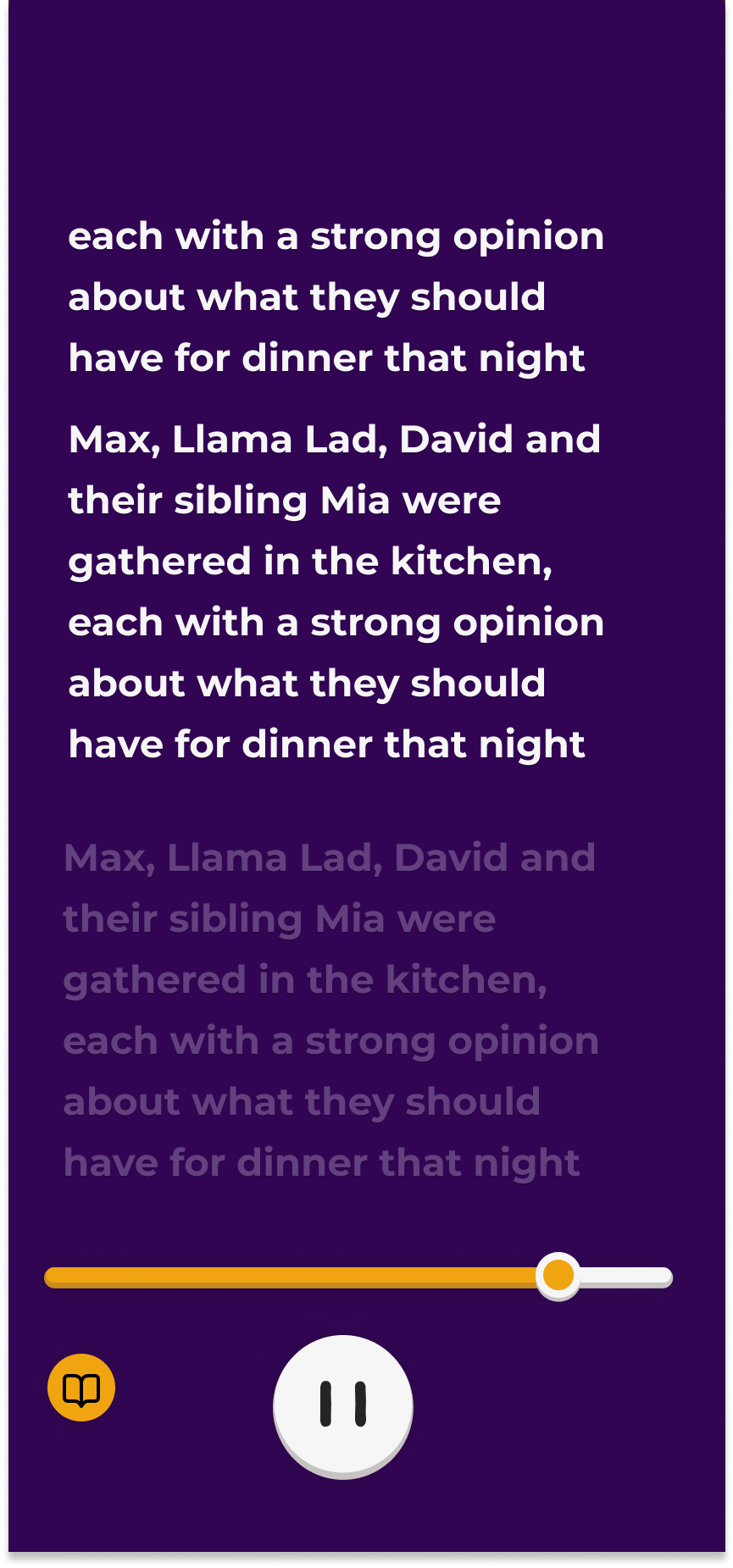
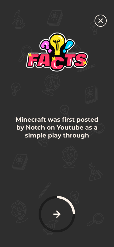
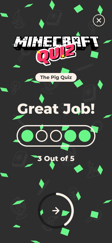
Peter Bot began as a joke. Could a chatbot serve as the interface to my portfolio? I started by writing and answering questions about each project, and myself. Then injecting those Q&As into a language model's prompt. That worked for a while, until the prompt got too long and I hit token limits. So, I switched to a vector database and a retrieval-augmented generation (RAG) approach. Now, Peter Bot retrieves the most relevant context on the fly. It can also access a database of image descriptions to pull in visuals related to the user’s questions. I’m using the same RAG technique to generate follow-up questions and keep the conversation going. What started as a joke became a pretty involved, and kind of cool little project.


Peter Bot
Personal Project
2025
The whole shabang
Peter Bot began as a joke. Could a chatbot serve as the interface to my portfolio? I started by writing and answering questions about each project, and myself. Then injecting those Q&As into a language model's prompt. That worked for a while, until the prompt got too long and I hit token limits. So, I switched to a vector database and a retrieval-augmented generation (RAG) approach. Now, Peter Bot retrieves the most relevant context on the fly. It can also access a database of image descriptions to pull in visuals related to the user’s questions. I’m using the same RAG technique to generate follow-up questions and keep the conversation going. What started as a joke became a pretty involved, and kind of cool little project.
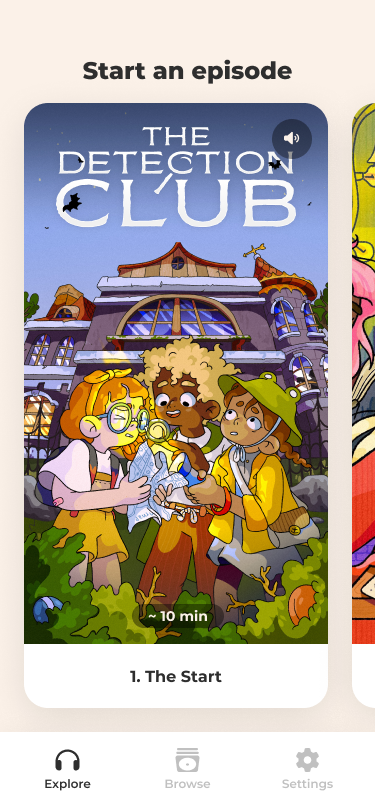
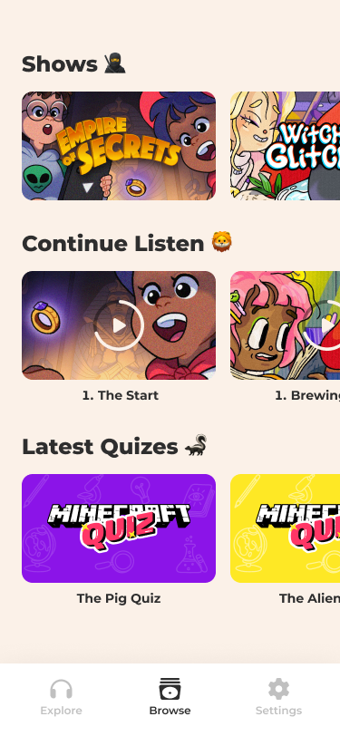
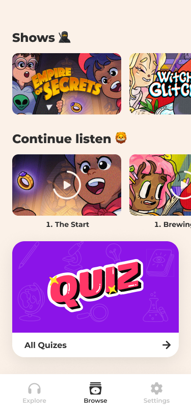
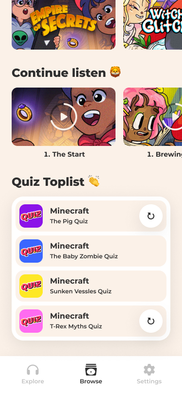
Superland
AWDIO
2023
CTO & Co-founder
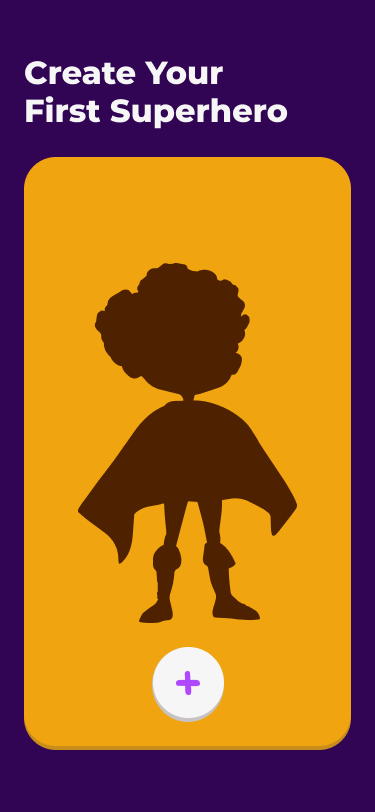
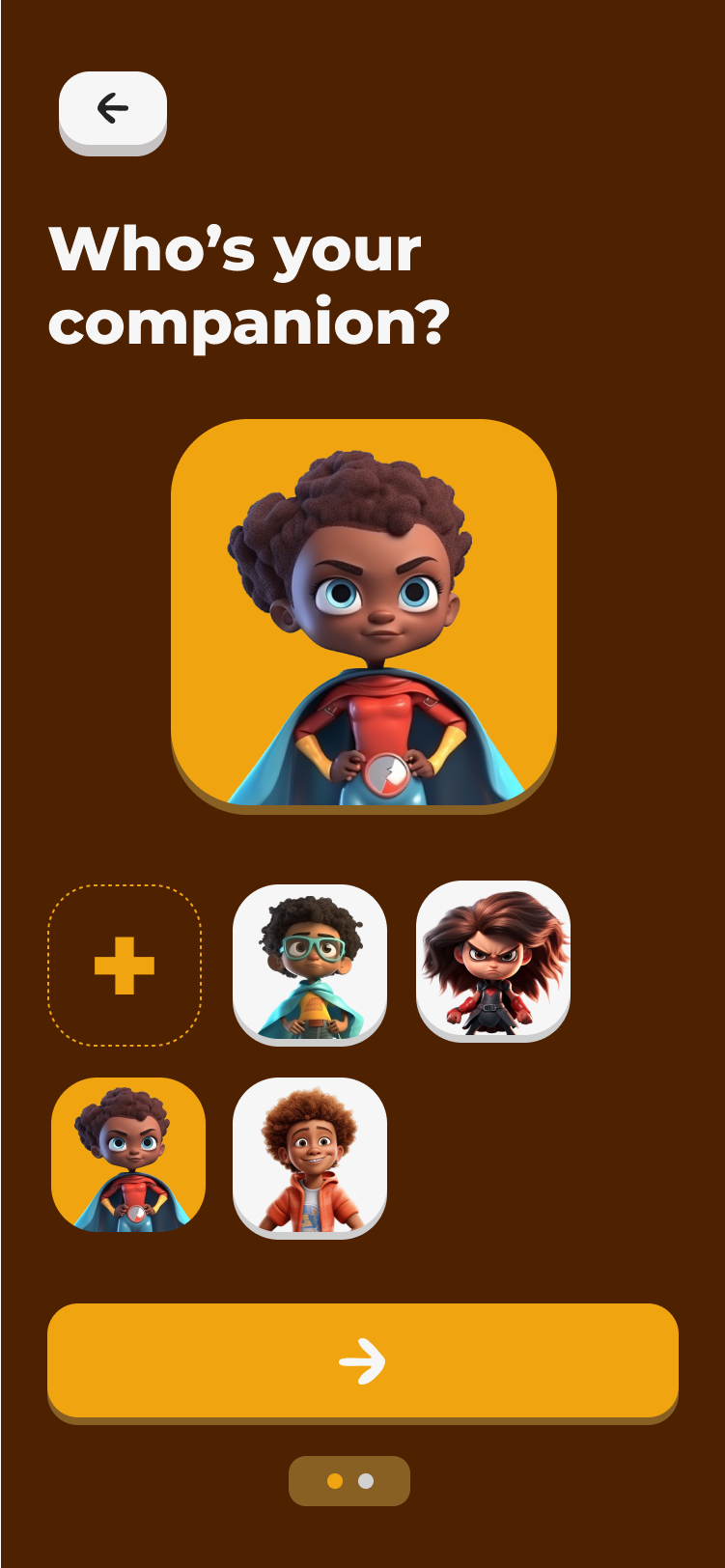
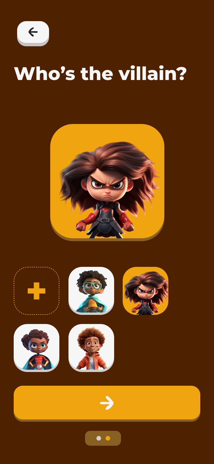
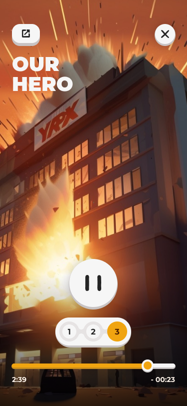
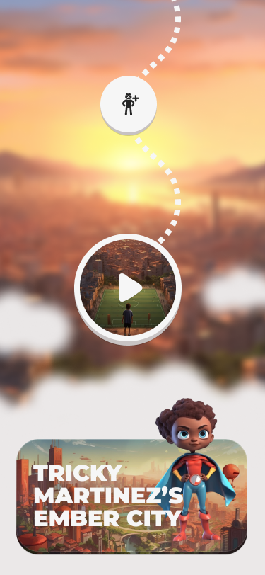
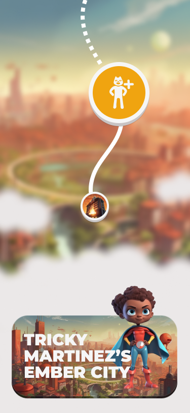
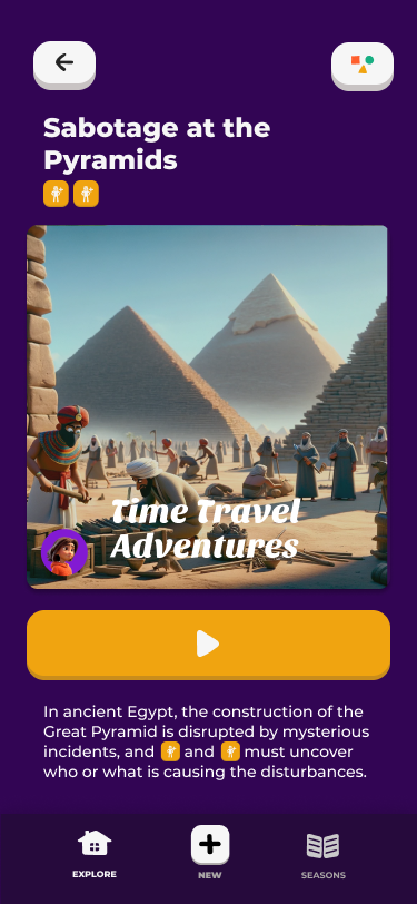
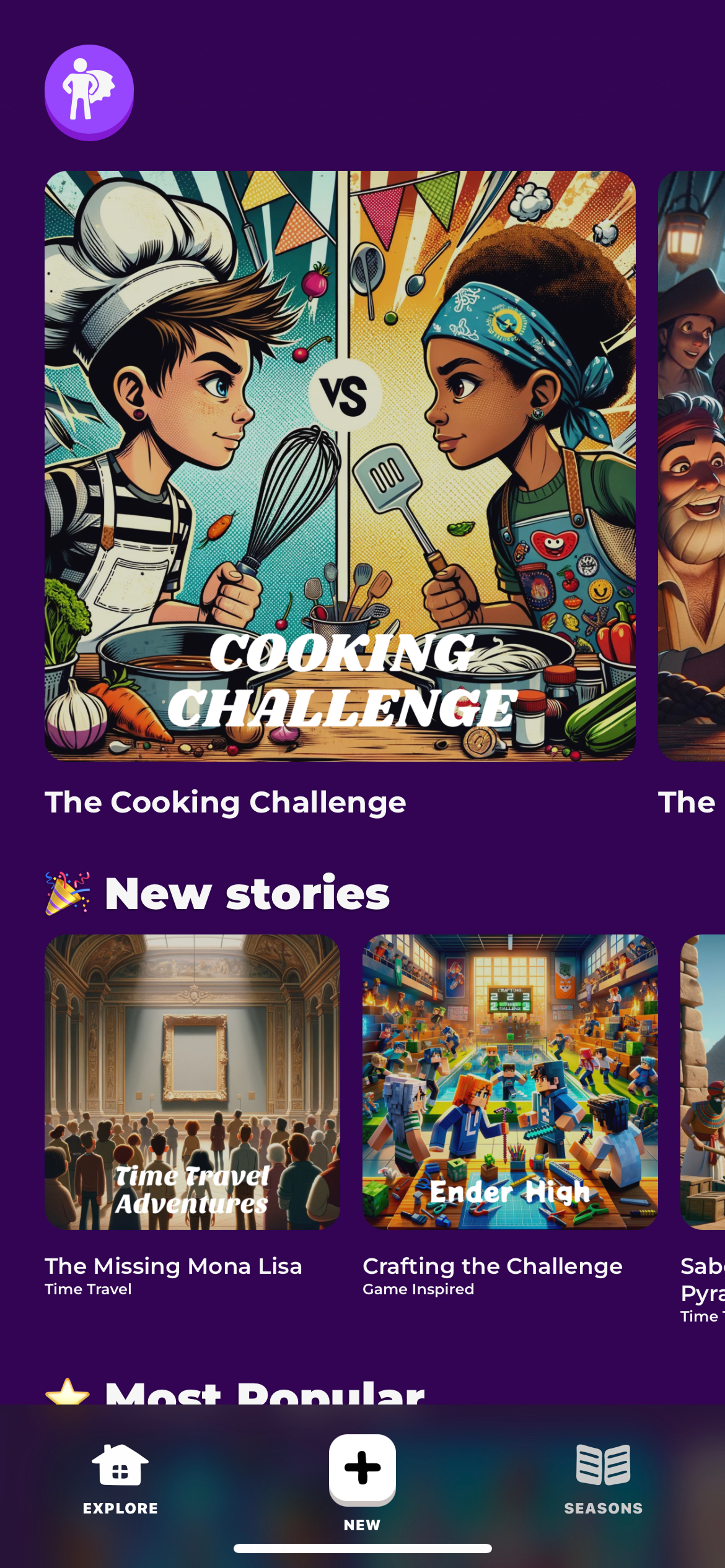
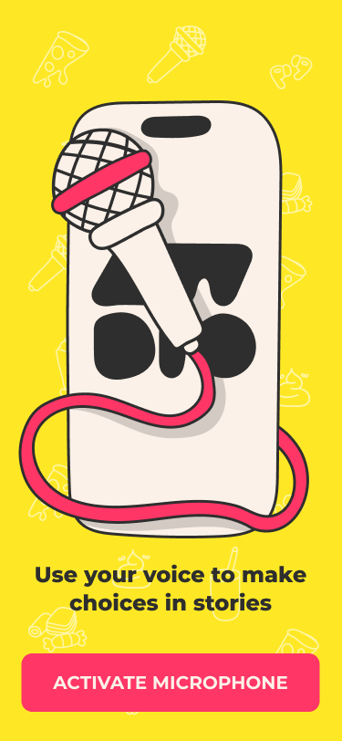
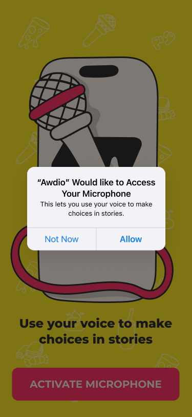
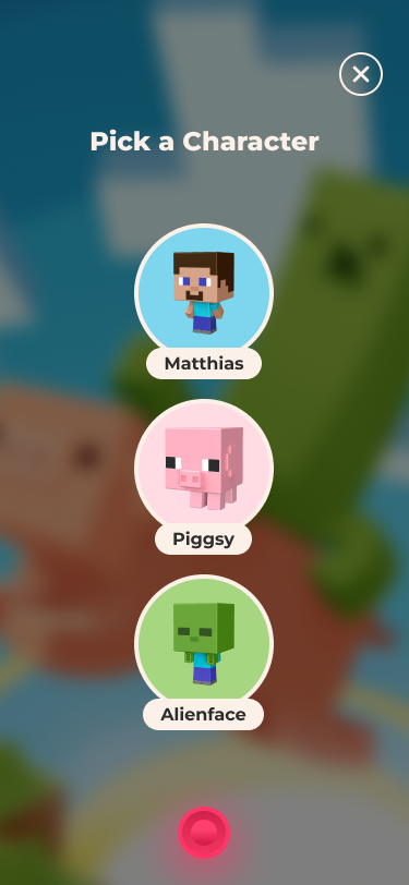
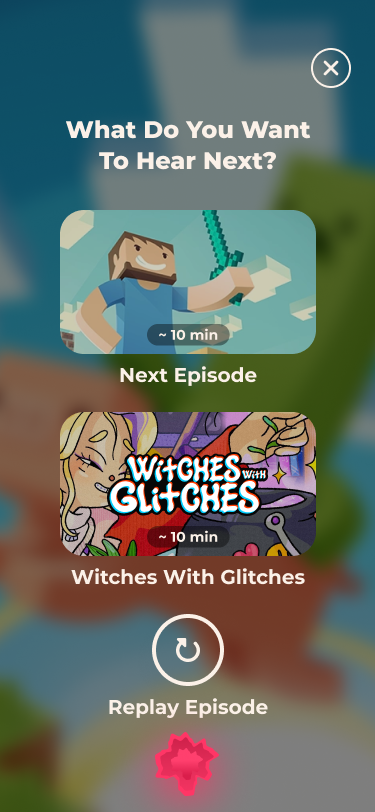
Was an AI-powered storytelling app for kids aged 4–12, built as a screen-light alternative to traditional entertainment. Born from a creative AI workshop at AWDIO, it lets children generate unique characters, places, and stories using GenAI, blending play and imagination. As CTO, I led the full technical architecture, including an offline-first mobile app, audio generation pipelines, and a custom story engine that created consistent, personalized narratives. Superland reached 4000+ monthly active users and became a beloved, playful experience for kids and parents alike.
Awards:
App of the Day

Superland
AWDIO
2023
CTO & Co-founder
Was an AI-powered storytelling app for kids aged 4–12, built as a screen-light alternative to traditional entertainment. Born from a creative AI workshop at AWDIO, it lets children generate unique characters, places, and stories using GenAI, blending play and imagination. As CTO, I led the full technical architecture, including an offline-first mobile app, audio generation pipelines, and a custom story engine that created consistent, personalized narratives. Superland reached 4000+ monthly active users and became a beloved, playful experience for kids and parents alike.
Awards:
App of the Day
AWDIO
AWDIO
2022
CTO & Co-founder
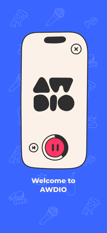
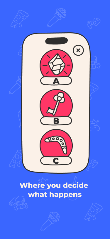
Was an interactive audio platform for kids, initially incubated at LEGO Ventures and later spun out as a startup. Aimed at children up to age 12, it offered choose-your-own-adventure style stories designed to be fun, educational, and screen-light. As CTO, I led the end-to-end tech development, building the React Native app, a modular backend, and a custom story editor. We produced five professionally voiced story series, tested them with over 100 families, and designed the app to work offline first. AWDIO laid the foundation for what later evolved into Superland, our GenAI-powered storytelling pivot.


AWDIO
AWDIO
2022
CTO & Co-founder
Was an interactive audio platform for kids, initially incubated at LEGO Ventures and later spun out as a startup. Aimed at children up to age 12, it offered choose-your-own-adventure style stories designed to be fun, educational, and screen-light. As CTO, I led the end-to-end tech development, building the React Native app, a modular backend, and a custom story editor. We produced five professionally voiced story series, tested them with over 100 families, and designed the app to work offline first. AWDIO laid the foundation for what later evolved into Superland, our GenAI-powered storytelling pivot.
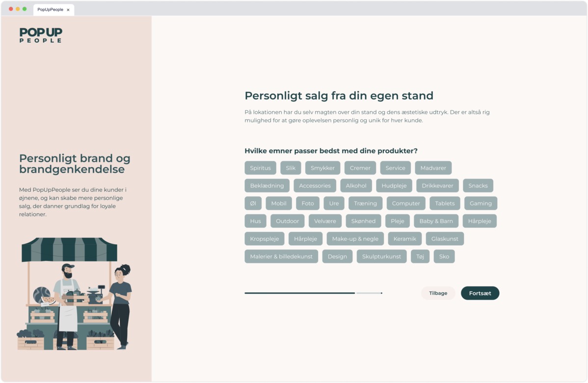
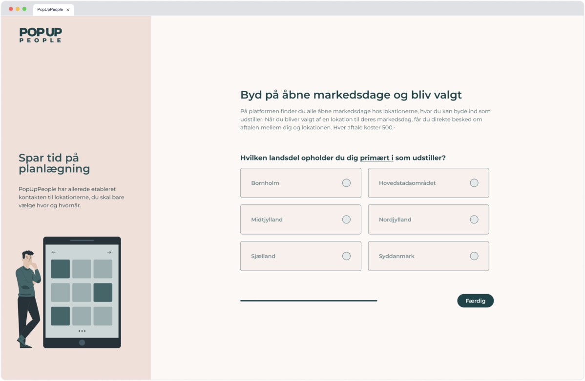
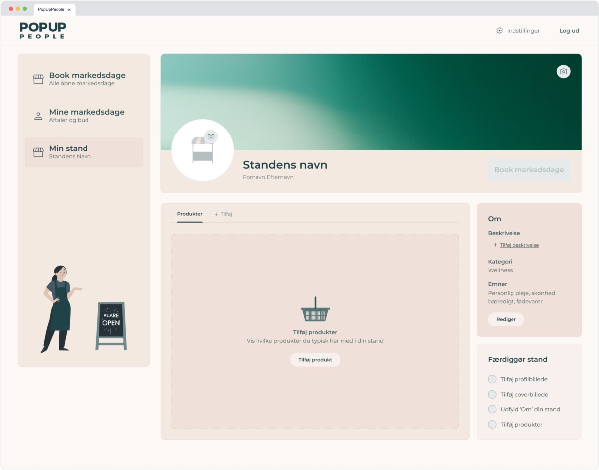
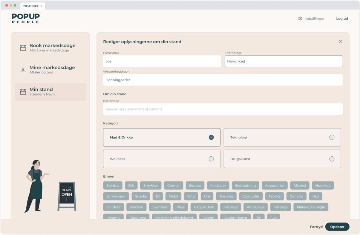
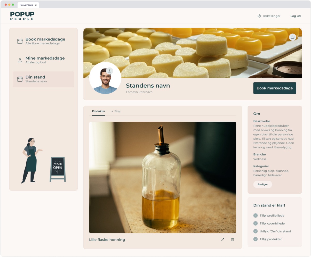
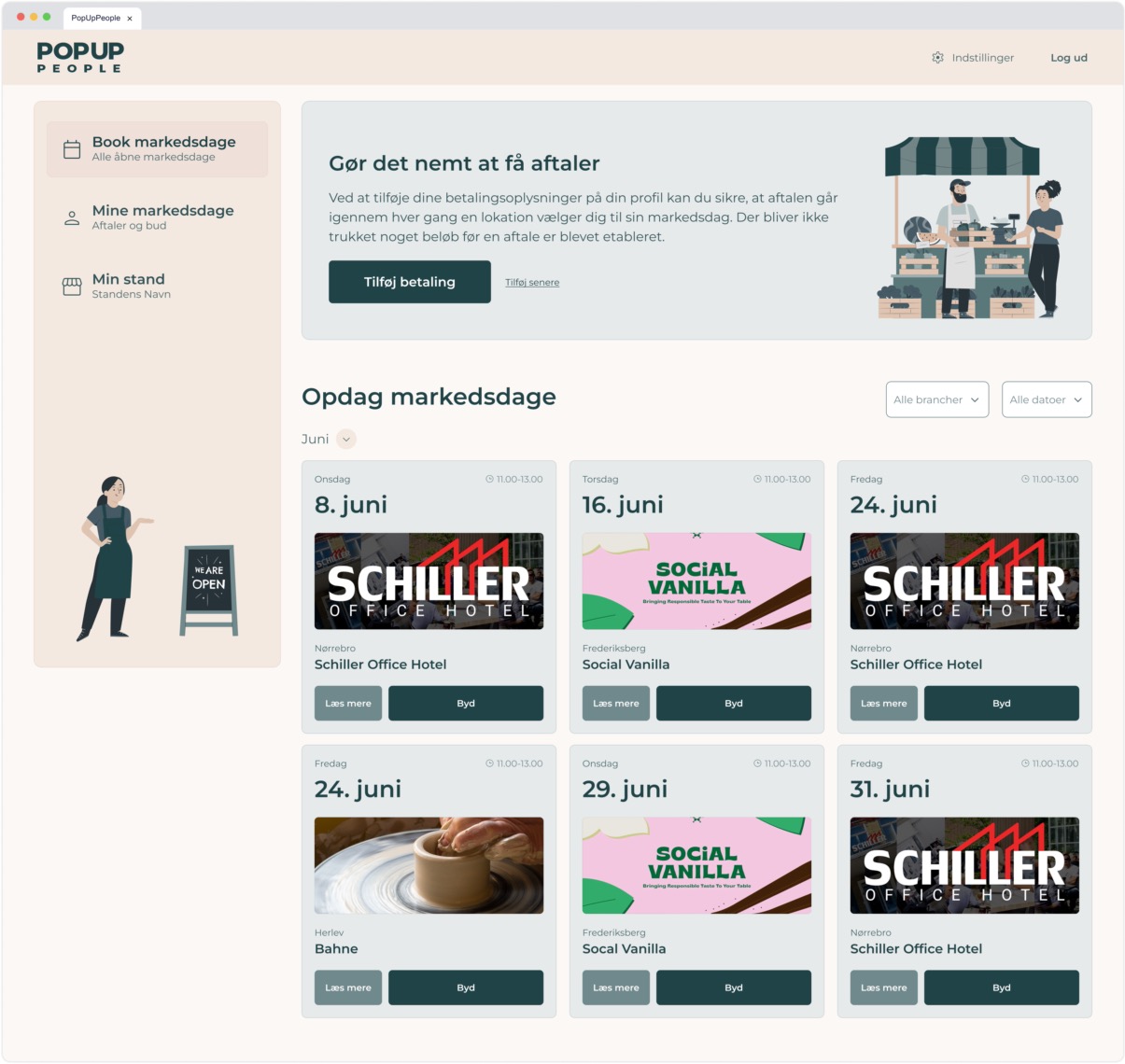
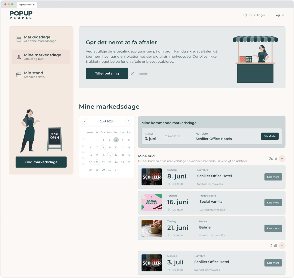
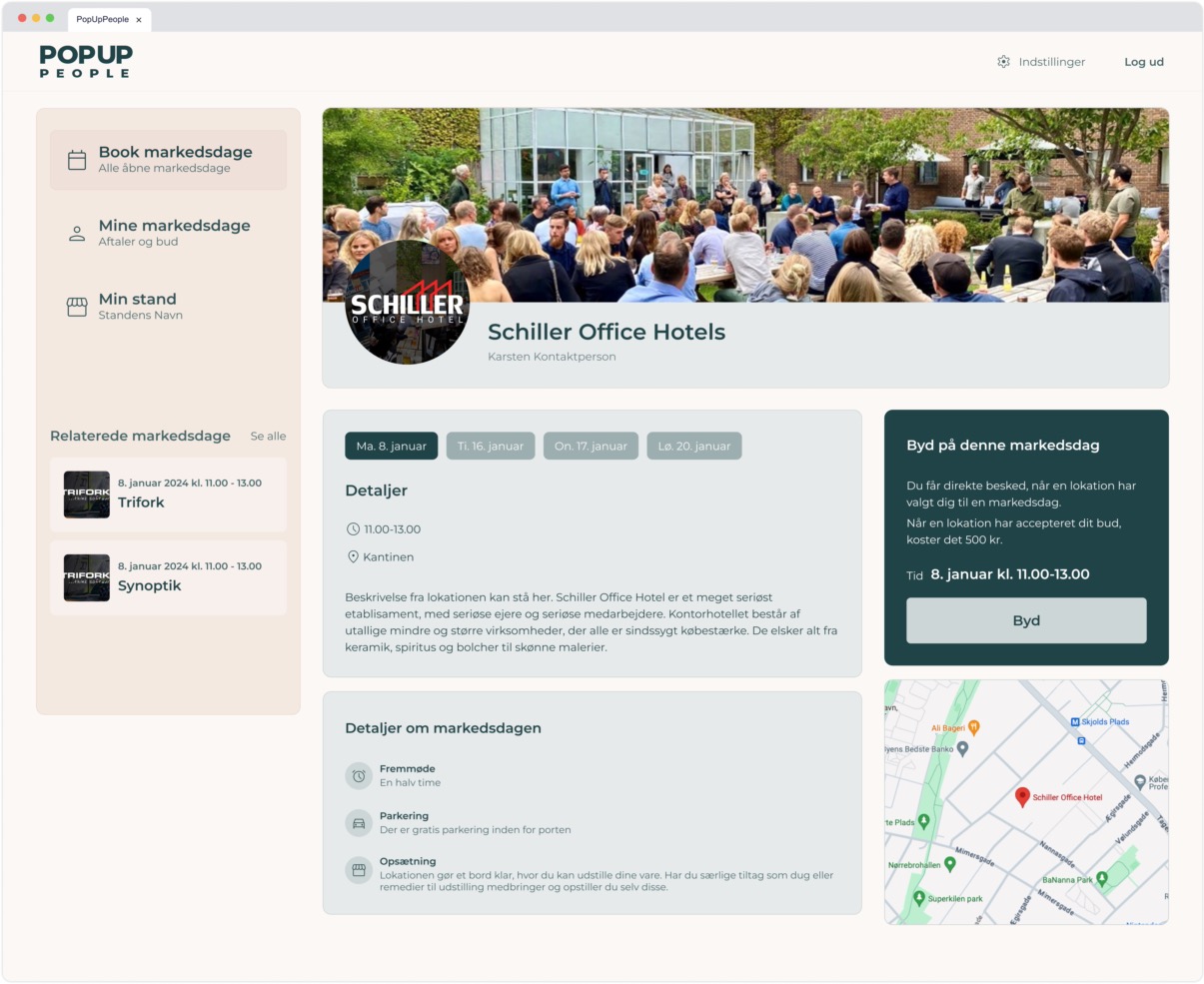
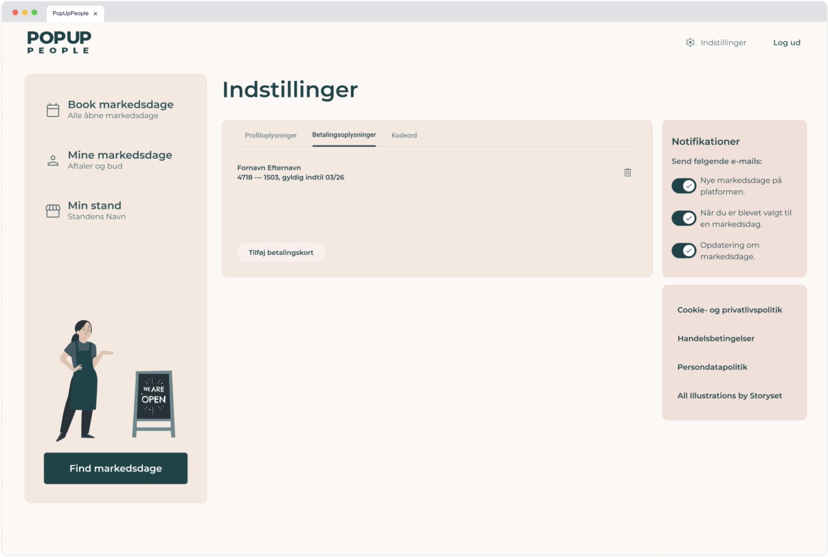
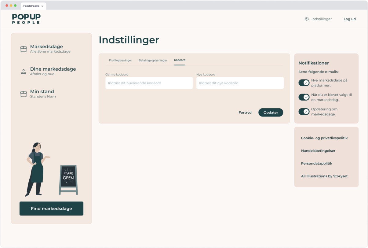
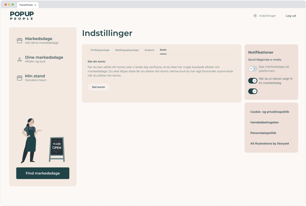
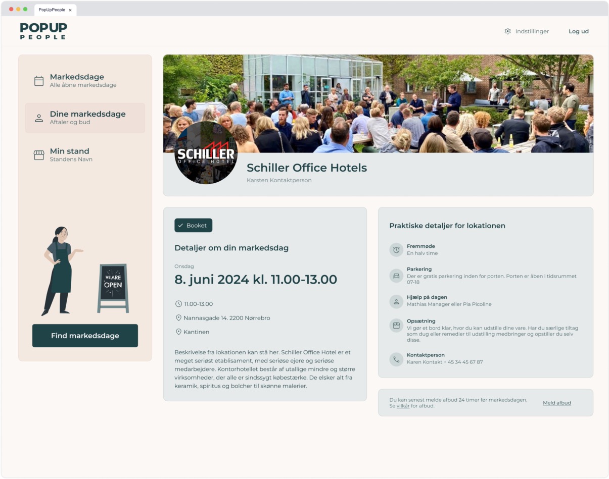
Pop Up People (PUP)
Pop Up People
2024
Freelance Developer
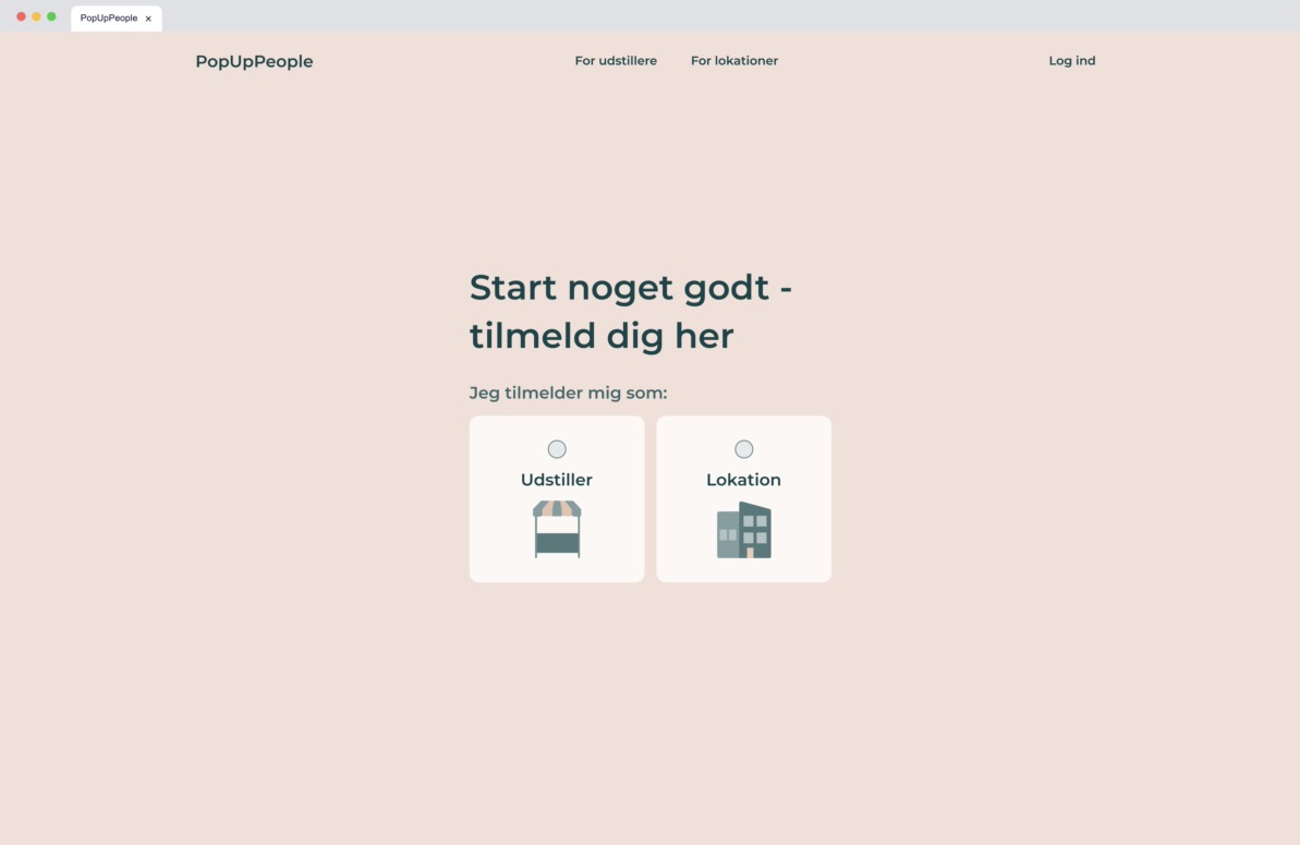
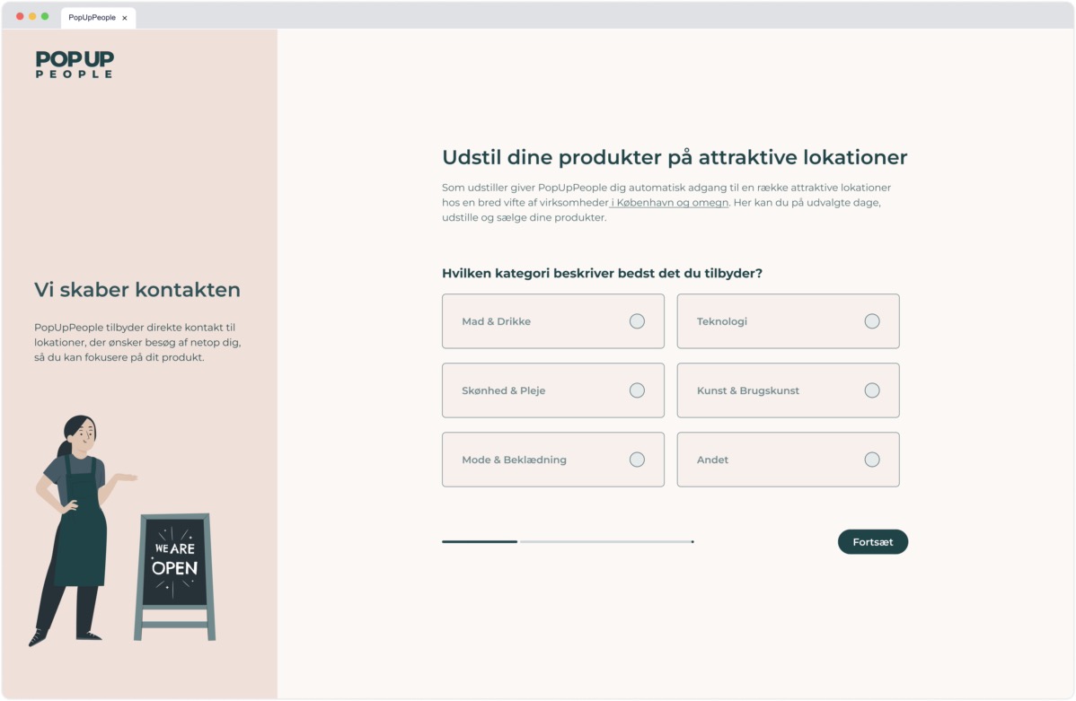
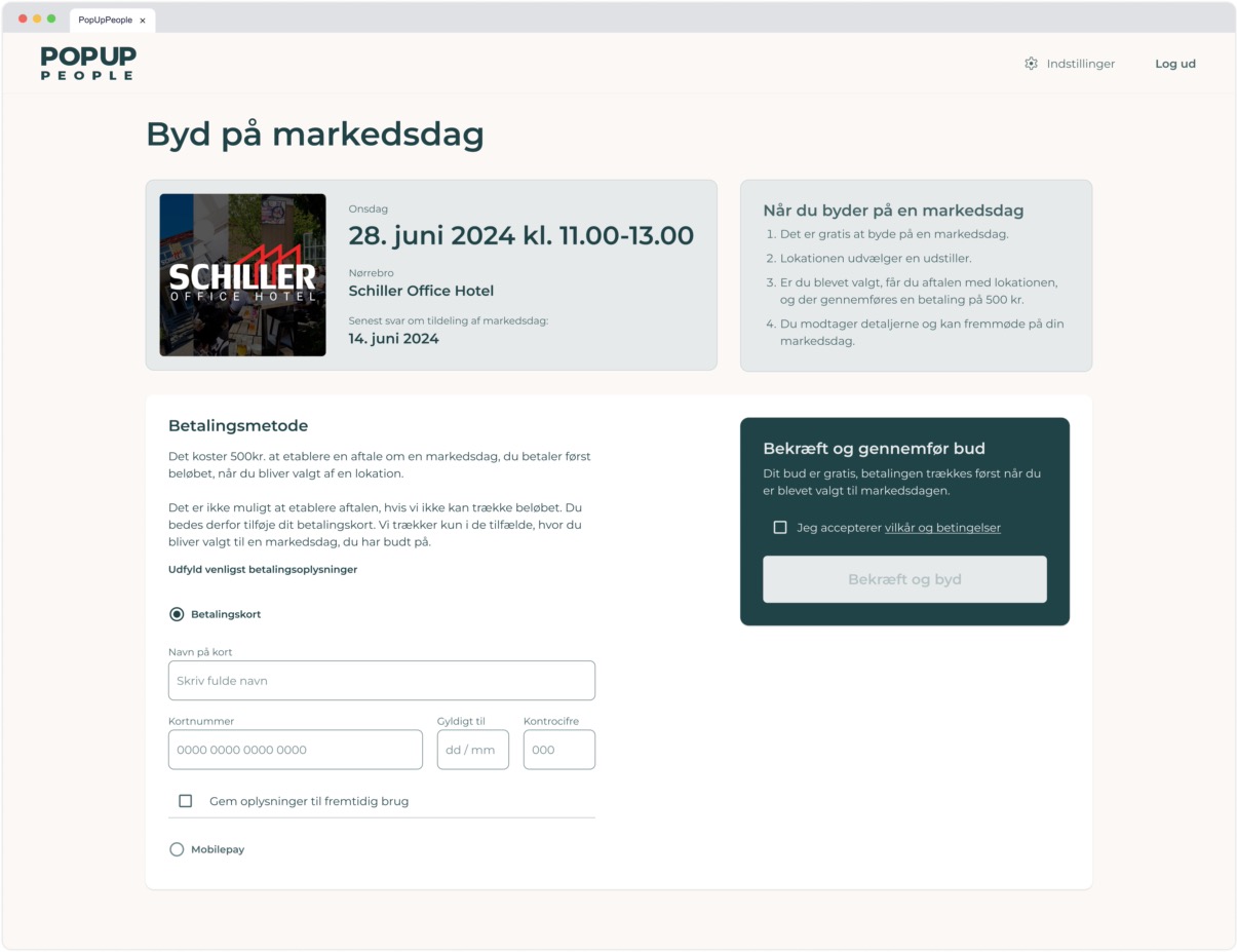
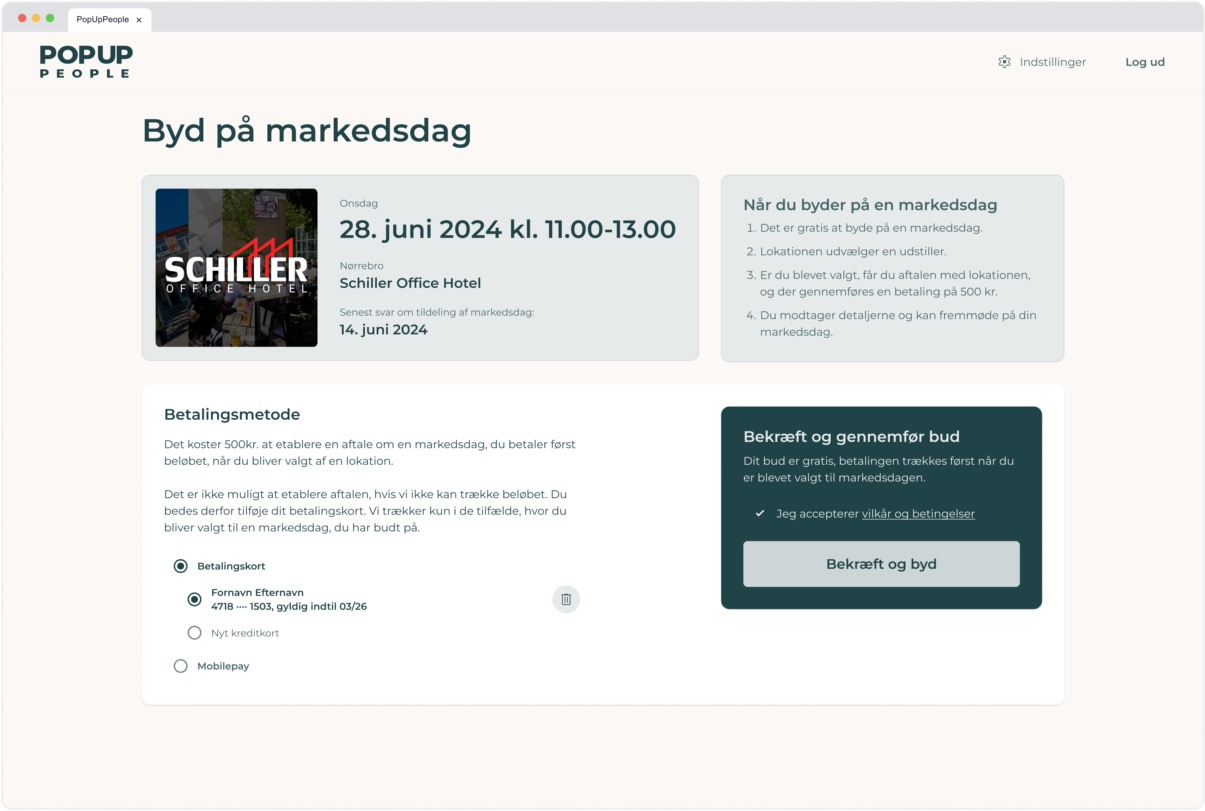
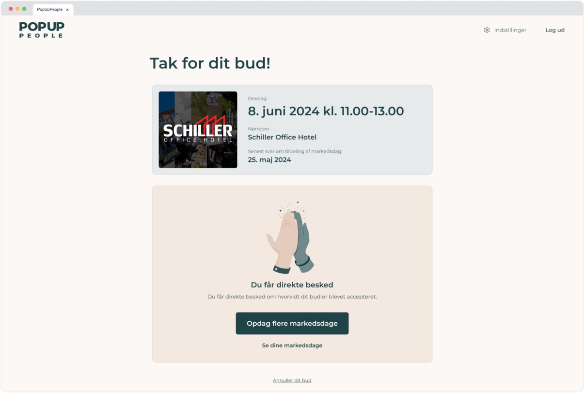
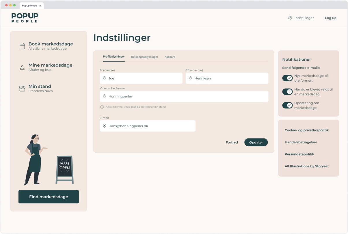
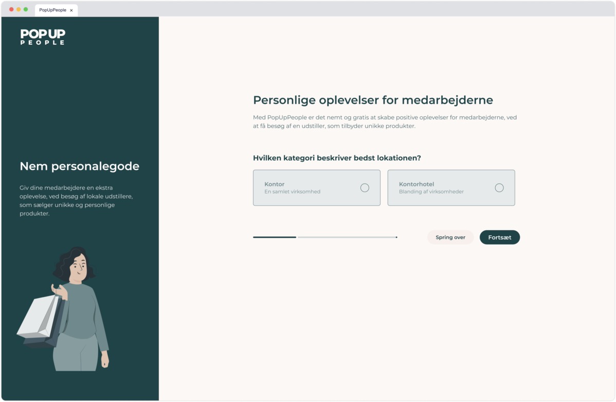
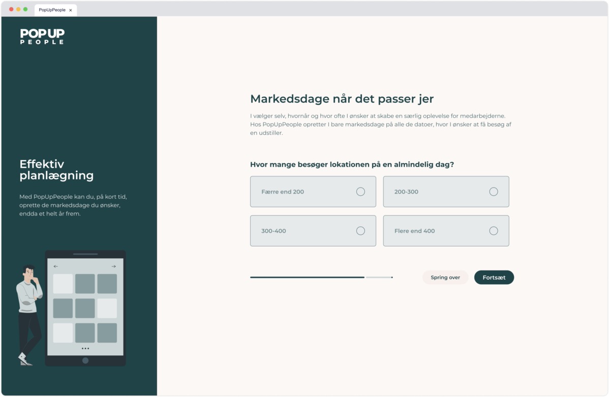
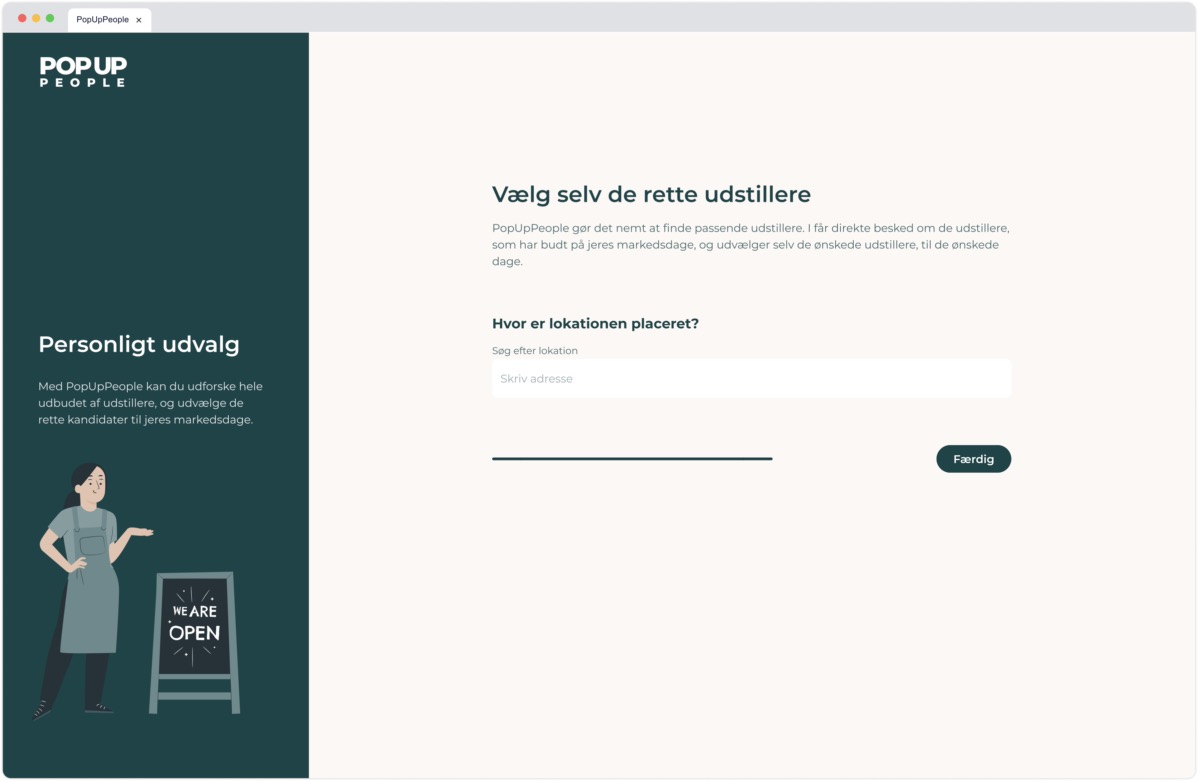
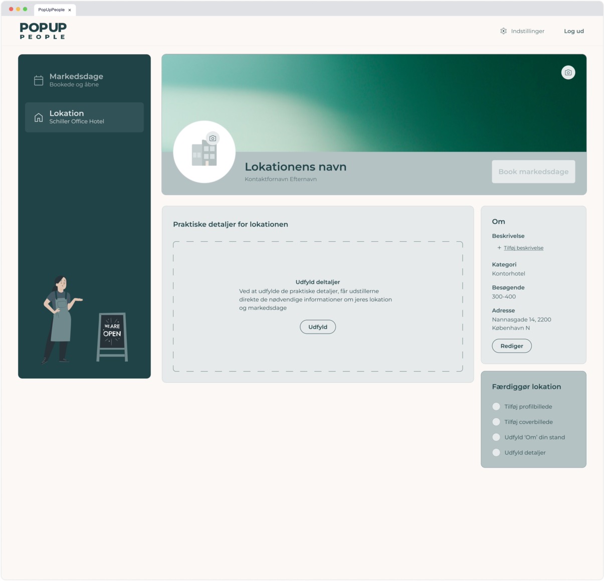
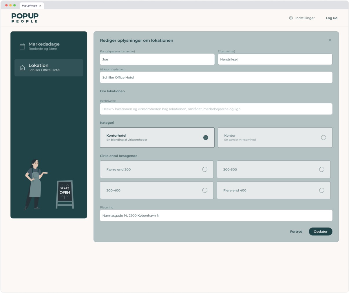
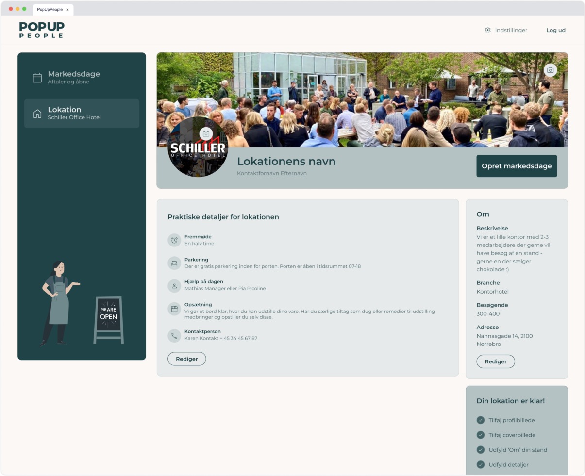
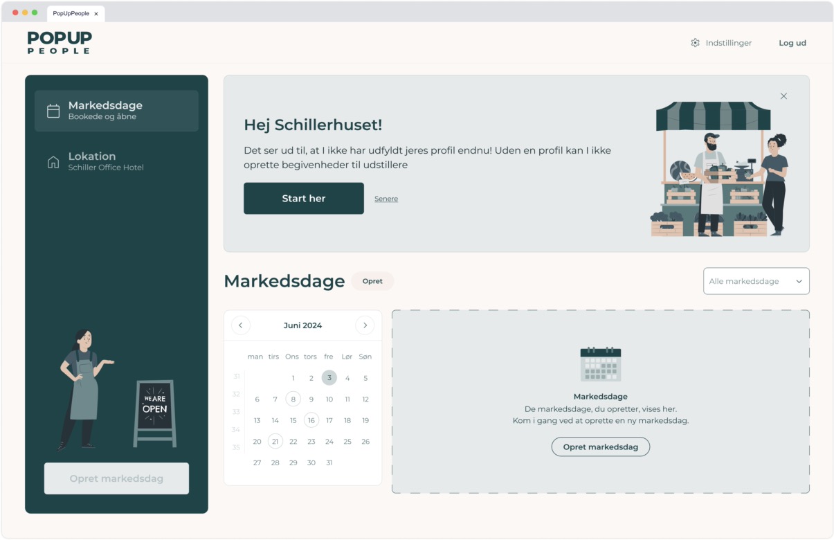
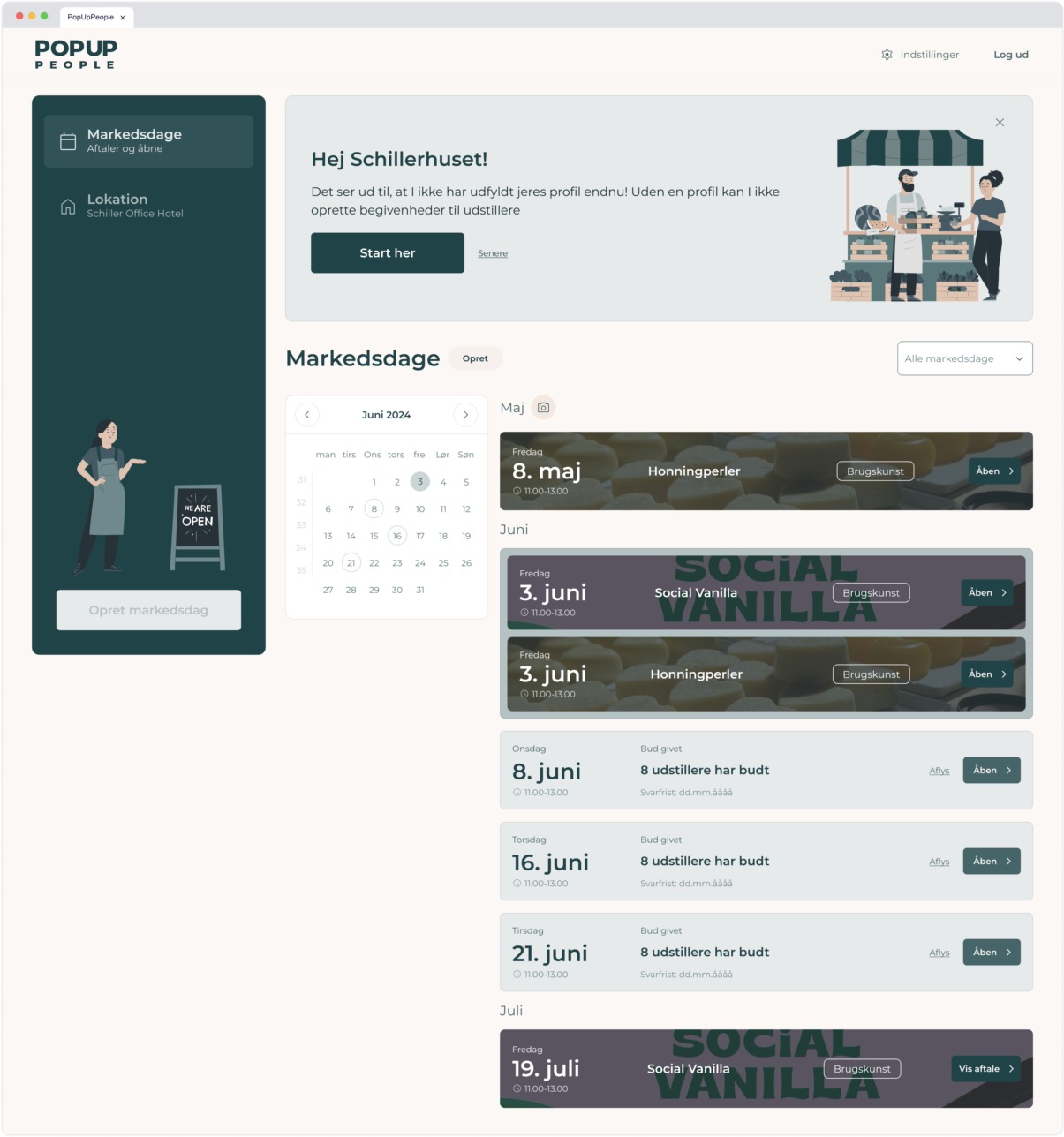
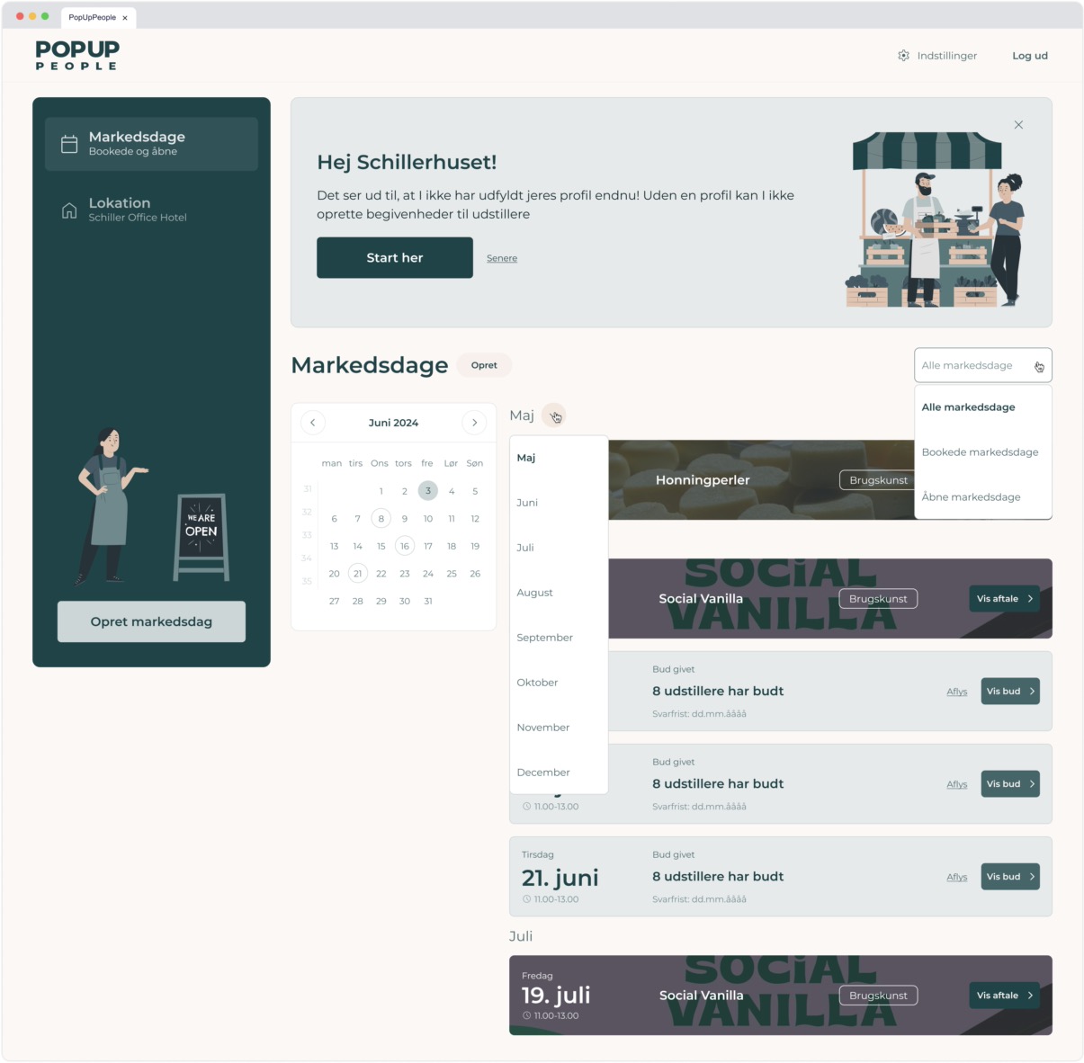
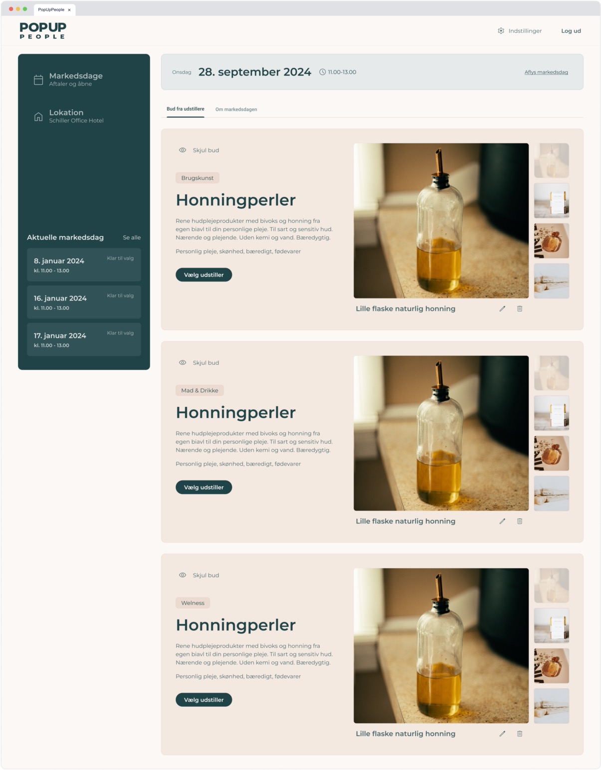
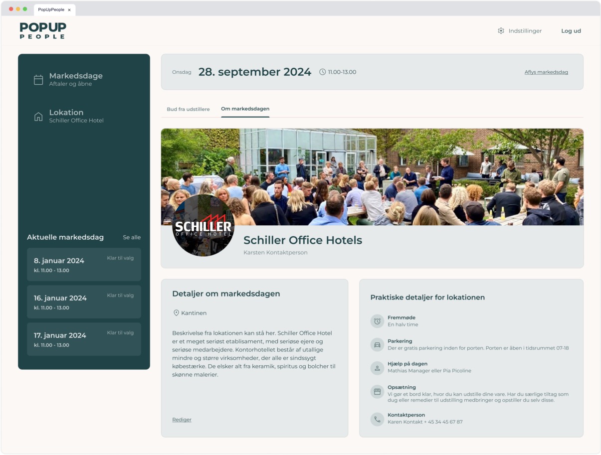
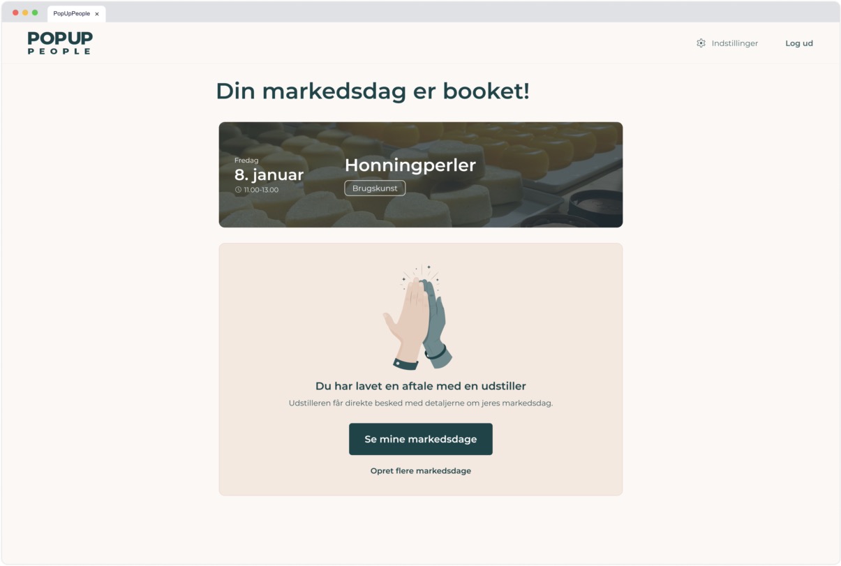
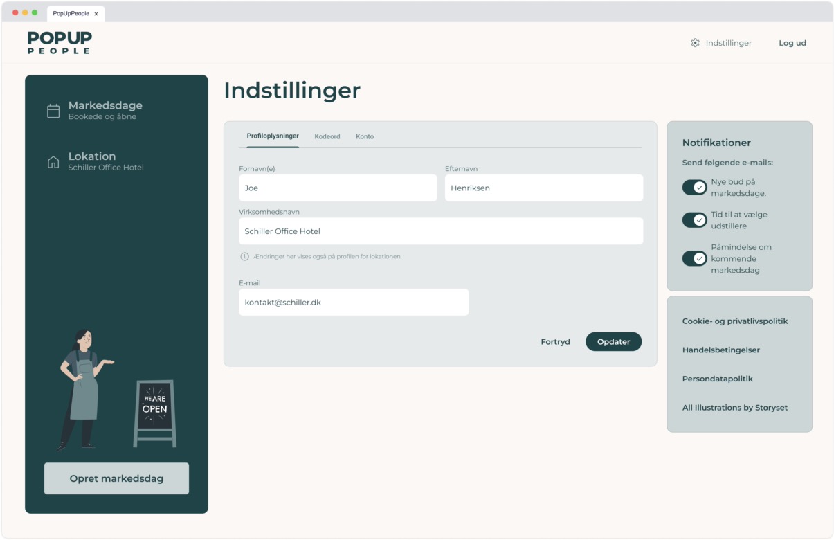
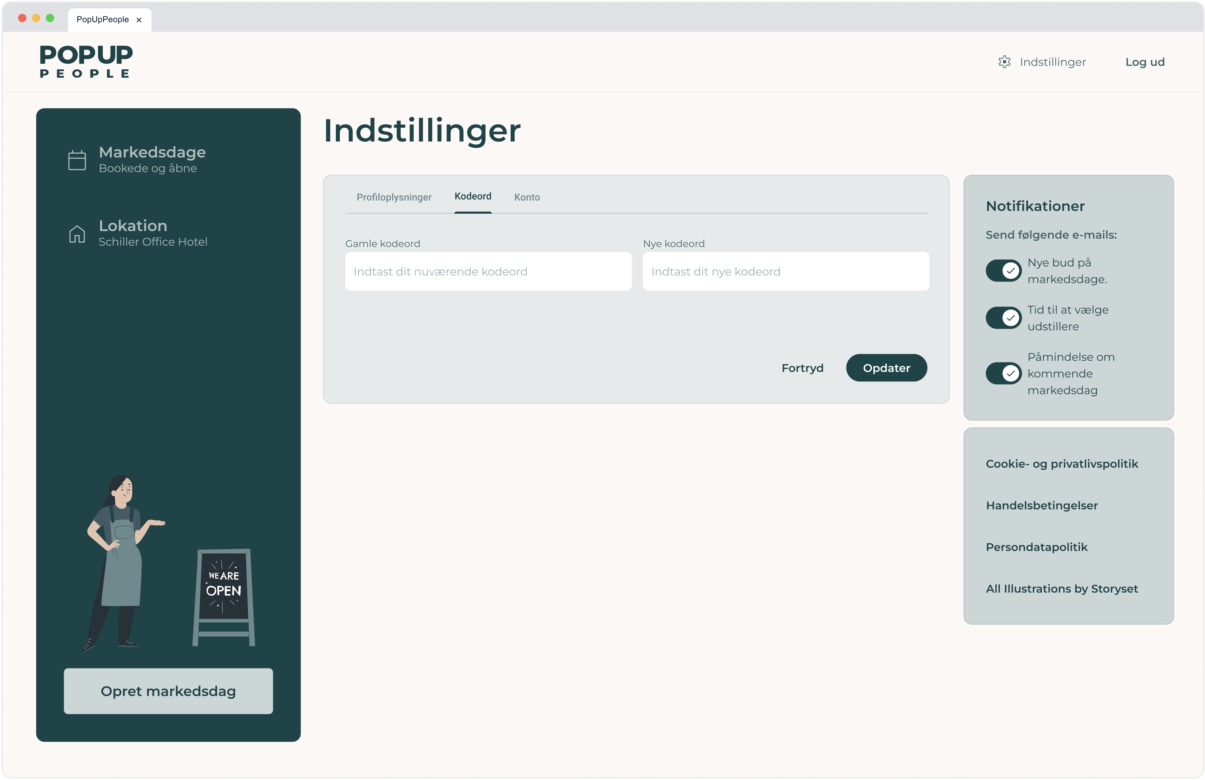
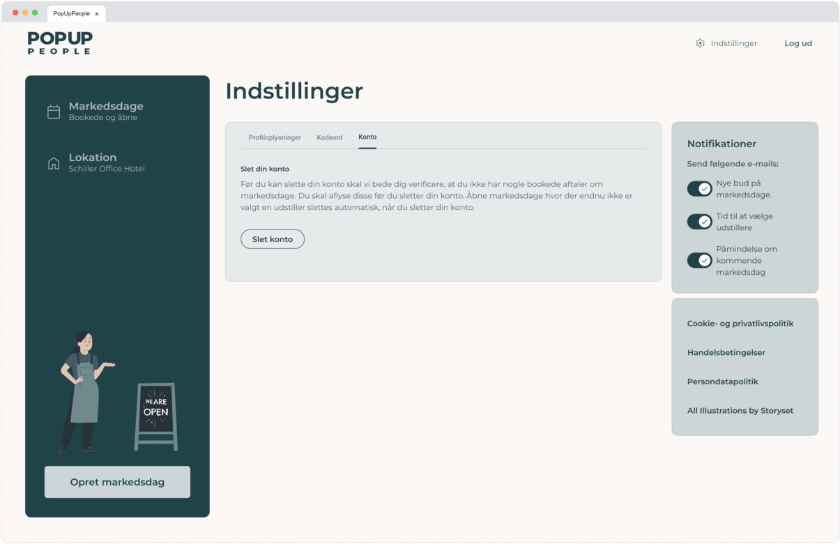
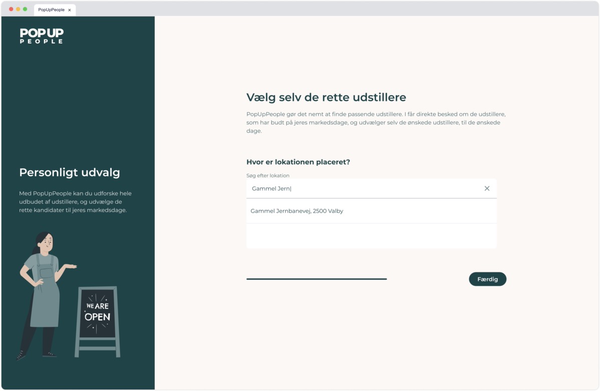
Launched in late 2024 as a freelance project for the Pop Up People team, this platform connects merchants without brick-and-mortar shops to offices and other venues interested in hosting market days. I took over a stalled codebase, re-scoped features to meet a tight timeline, and built the full-stack solution with Next.js, Tailwind CSS, shadcn UI, and PostgreSQL. A custom bidding engine handles market-day scheduling, bid deadlines, and deferred Stripe payments for winning merchants. Although the core web experience is live, mobile optimization is underway as adoption grows.
Pop Up People (PUP)
Pop Up People
2024
Freelance Developer
Launched in late 2024 as a freelance project for the Pop Up People team, this platform connects merchants without brick-and-mortar shops to offices and other venues interested in hosting market days. I took over a stalled codebase, re-scoped features to meet a tight timeline, and built the full-stack solution with Next.js, Tailwind CSS, shadcn UI, and PostgreSQL. A custom bidding engine handles market-day scheduling, bid deadlines, and deferred Stripe payments for winning merchants. Although the core web experience is live, mobile optimization is underway as adoption grows.
Bear & Co
CIID Research / VIRT-EU
2019
Principal Investigator & Designer
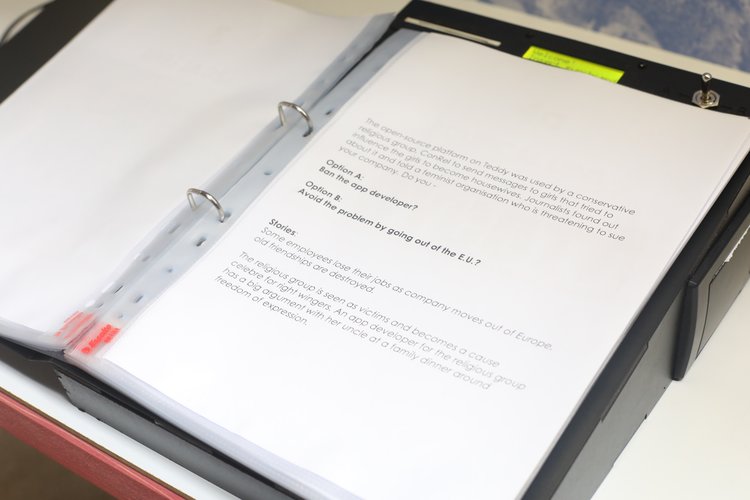
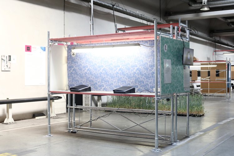
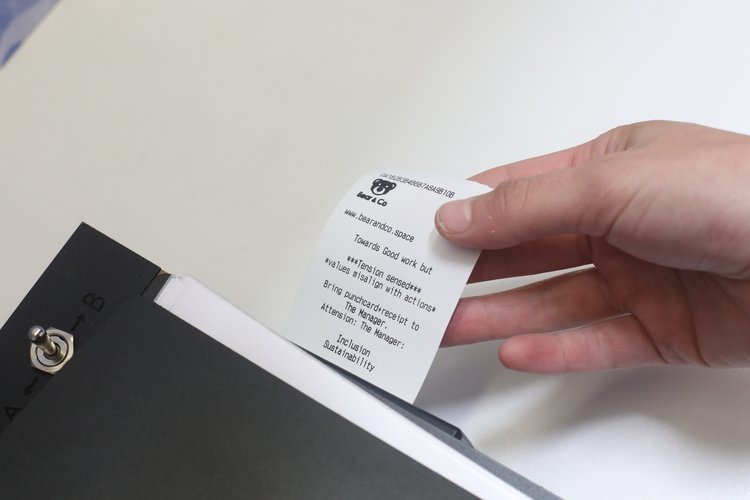
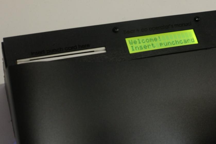
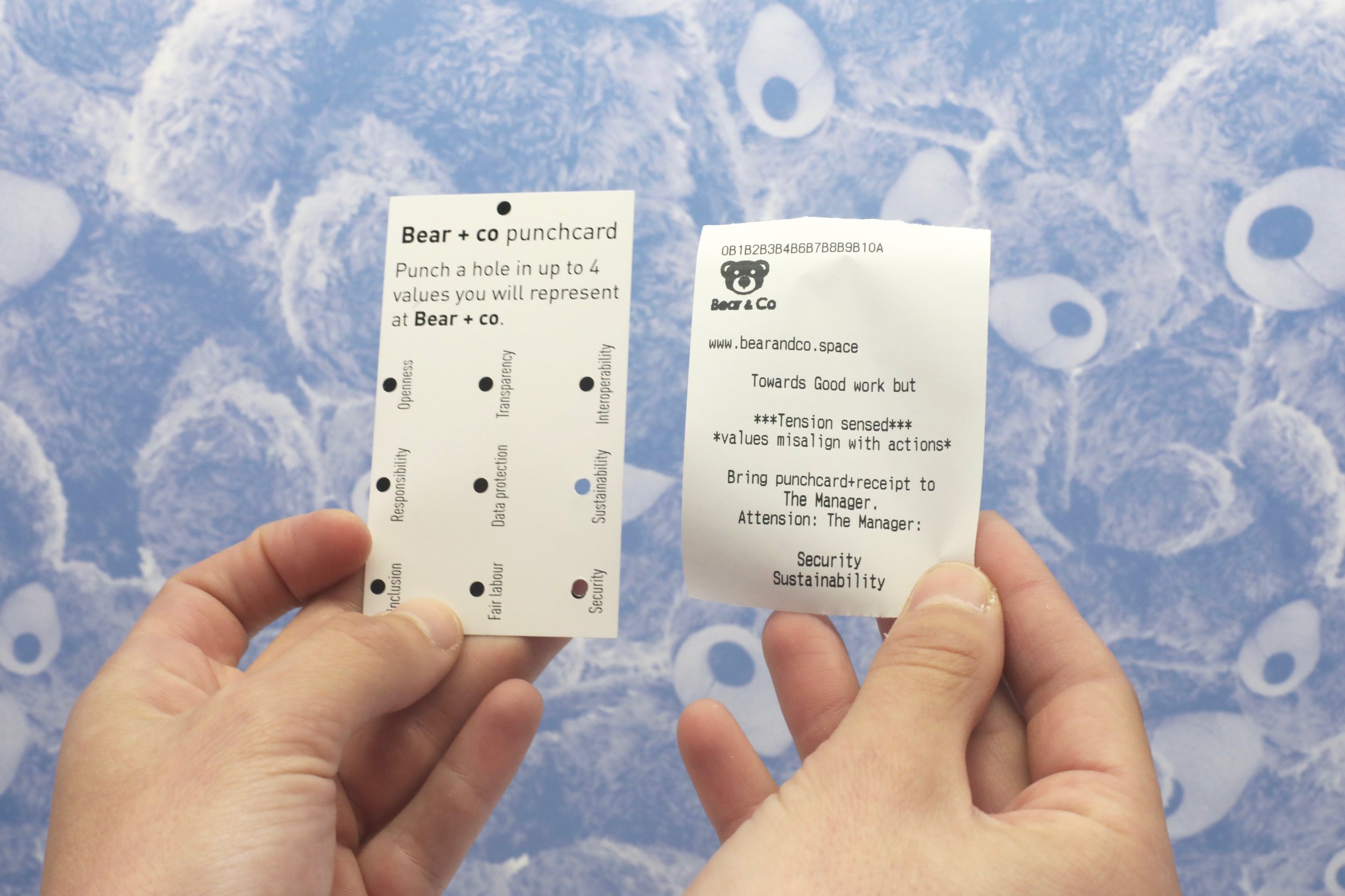
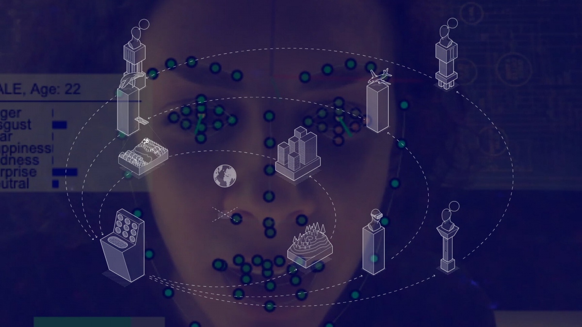
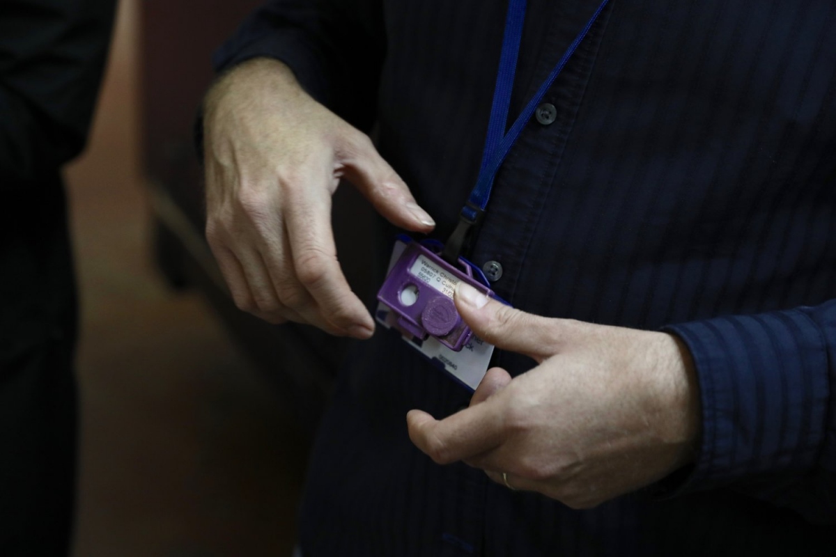
Bear & Co is an immersive installation by the CIID Research group for the VIRT-EU project that simulates ethical value conflicts within an IoT start-up. Participants join as “new employees,” punch their core values onto a custom card, work through scenario-based dilemmas grounded in virtue ethics, the capabilities approach, and care ethics, and then debrief to explore any misalignments. Staged at Ars Electronica in September 2018 and demoed at ACM CHI 2019, it uses hands-on role play and structured reflection to integrate ethical reasoning into the design process.
Awards:
Honorary Mention, FastCompany 2019 Innovation by Design Awards (Experimental)
Bear & Co
CIID Research / VIRT-EU
2019
Principal Investigator & Designer
Bear & Co is an immersive installation by the CIID Research group for the VIRT-EU project that simulates ethical value conflicts within an IoT start-up. Participants join as “new employees,” punch their core values onto a custom card, work through scenario-based dilemmas grounded in virtue ethics, the capabilities approach, and care ethics, and then debrief to explore any misalignments. Staged at Ars Electronica in September 2018 and demoed at ACM CHI 2019, it uses hands-on role play and structured reflection to integrate ethical reasoning into the design process.
Awards:
Honorary Mention, FastCompany 2019 Innovation by Design Awards (Experimental)
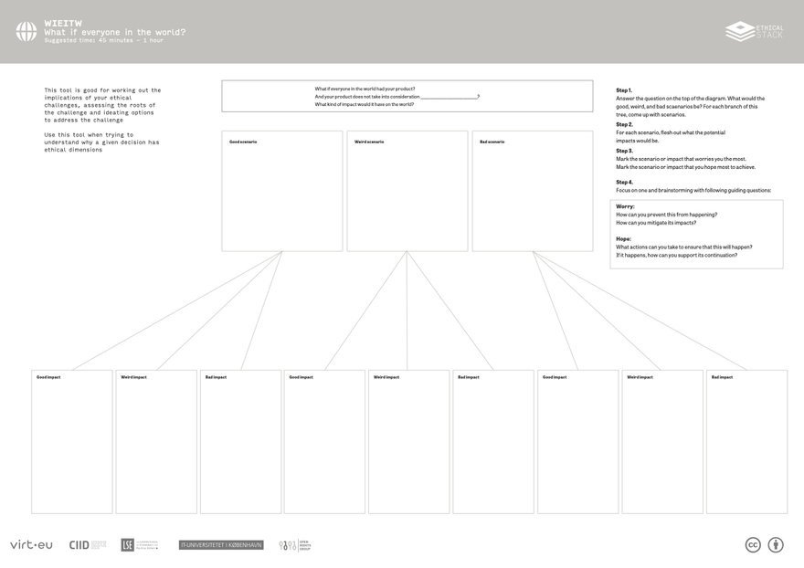
The Ethical Stack
CIID Research / VIRT-EU
2021
Concept, UX, Wireframes & Prototype Developer
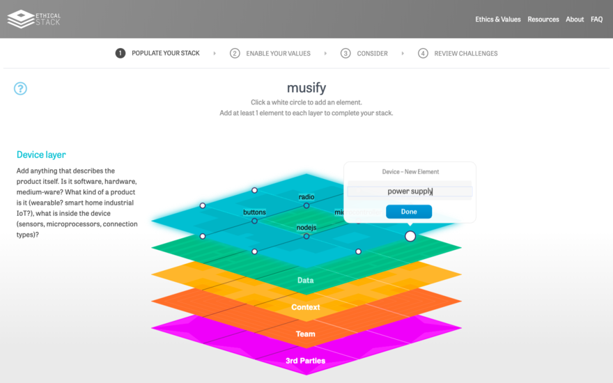
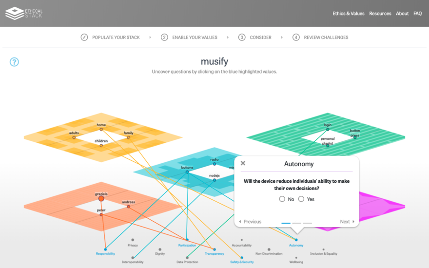
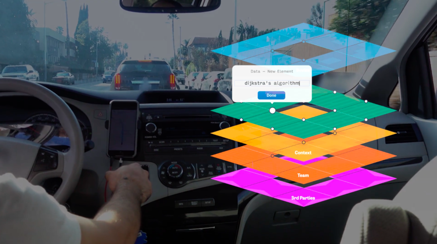
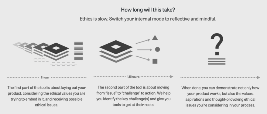
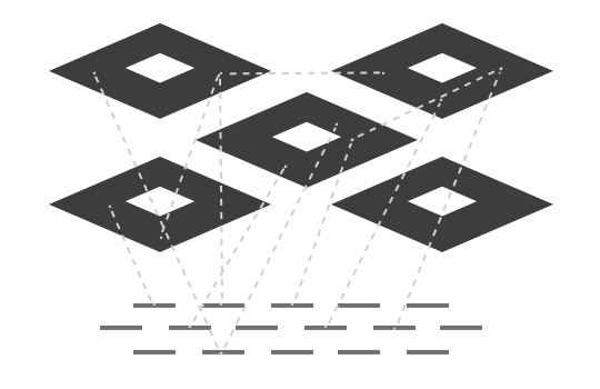
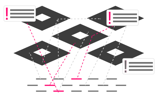
The Ethical Stack is a responsive interface of paper and digital tools by CIID Research for the VIRT-EU project that structures ethical reflection throughout the design and development of connected technologies. Teams begin by mapping their product’s layered impacts and aligning on core values, then work through the Stack’s modules to create, connect, consider, and re-think social and ethical implications, and finally receive tailored ethical challenges with practical guidance. Developed over three years of co-creation and testing with entrepreneurs, developers, and designers in Copenhagen, Amsterdam, and London, it embeds virtue ethics, the capabilities approach, and care ethics into everyday product workflows.
Awards:
Core77 2020 Runner Up in Strategy & Research Award
Core77 2020 Notable in Design for Social Impact Award
Fast Company Honourable Mention, World Changing Ideas Awards

The Ethical Stack
CIID Research / VIRT-EU
2021
Concept, UX, Wireframes & Prototype Developer
The Ethical Stack is a responsive interface of paper and digital tools by CIID Research for the VIRT-EU project that structures ethical reflection throughout the design and development of connected technologies. Teams begin by mapping their product’s layered impacts and aligning on core values, then work through the Stack’s modules to create, connect, consider, and re-think social and ethical implications, and finally receive tailored ethical challenges with practical guidance. Developed over three years of co-creation and testing with entrepreneurs, developers, and designers in Copenhagen, Amsterdam, and London, it embeds virtue ethics, the capabilities approach, and care ethics into everyday product workflows.
Awards:
Core77 2020 Runner Up in Strategy & Research Award
Core77 2020 Notable in Design for Social Impact Award
Fast Company Honourable Mention, World Changing Ideas Awards
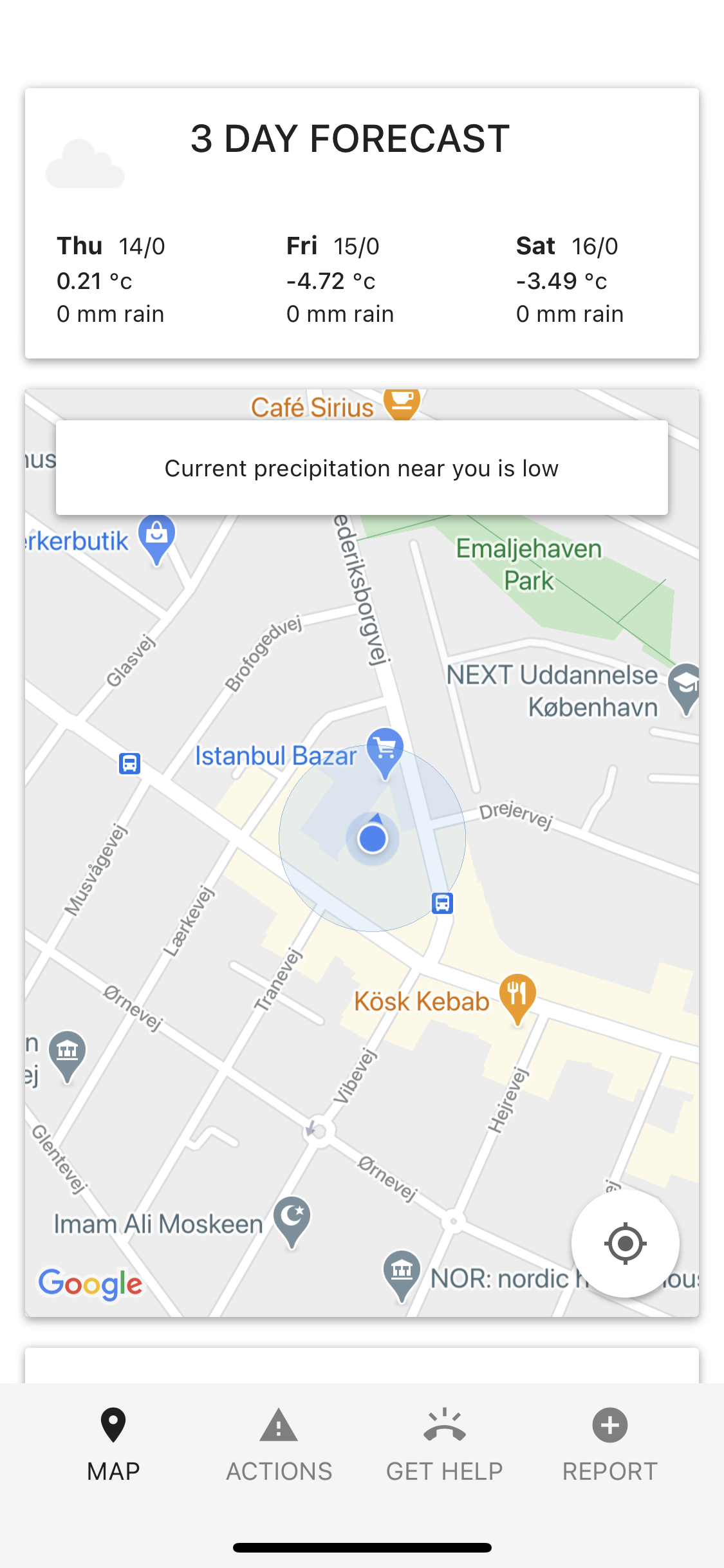
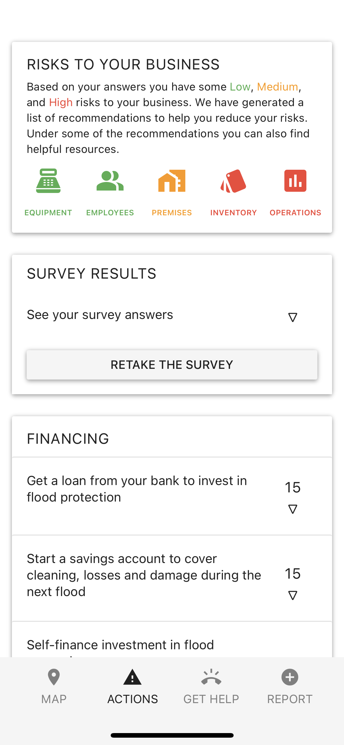
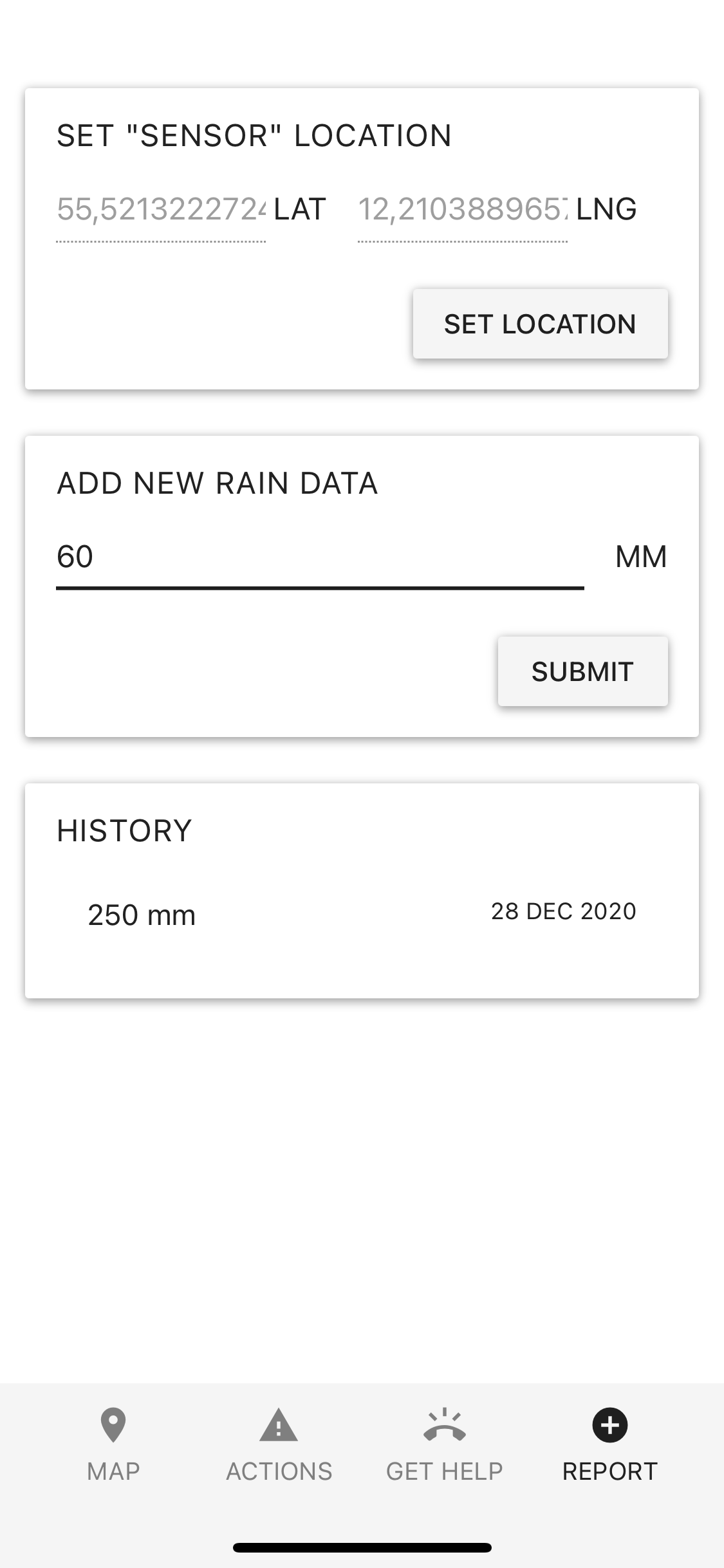
Building Businesses’ Climate Resilience Tool
UNEP DTU / ADPC / Ceylon Chamber of Commerce
2018–2021
Research, UX, UI & Prototype Developer
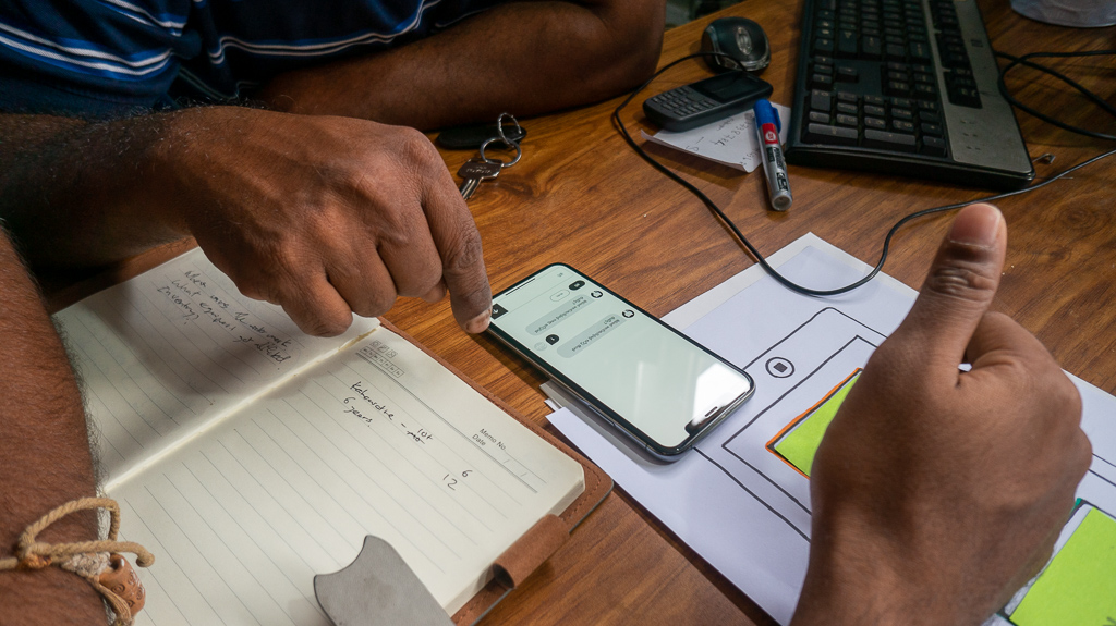
Building Businesses’ Climate Resilience (BBCR) is a mobile application and toolkit co-developed by the UNEP DTU Partnership, Asian Disaster Preparedness Center, Ceylon Chamber of Commerce, and MPEnsystems with funding from the Nordic Climate Facility. Launched as a project in September 2018 and unveiled at a regional dissemination forum in Colombo on 28 September 2021, BBCR guides Sri Lankan SMEs and their support agencies through flood-risk assessment, preparedness actions, and recovery planning. Informed by three weeks of on-the-ground research, interviews, co-creation workshops, and prototype testing in Sri Lanka, the app delivers accessible, context-specific recommendations to help small businesses maintain continuity and build long-term resilience against climate-driven disasters.


Building Businesses’ Climate Resilience Tool
UNEP DTU / ADPC / Ceylon Chamber of Commerce
2018–2021
Research, UX, UI & Prototype Developer
Building Businesses’ Climate Resilience (BBCR) is a mobile application and toolkit co-developed by the UNEP DTU Partnership, Asian Disaster Preparedness Center, Ceylon Chamber of Commerce, and MPEnsystems with funding from the Nordic Climate Facility. Launched as a project in September 2018 and unveiled at a regional dissemination forum in Colombo on 28 September 2021, BBCR guides Sri Lankan SMEs and their support agencies through flood-risk assessment, preparedness actions, and recovery planning. Informed by three weeks of on-the-ground research, interviews, co-creation workshops, and prototype testing in Sri Lanka, the app delivers accessible, context-specific recommendations to help small businesses maintain continuity and build long-term resilience against climate-driven disasters.
NeXTWORKS
ROCKWOOL Foundation / Danish municipalities
2017–2022
Project Manager & Designer
NeXTWORKS is a network-oriented service co-designed with the ROCKWOOL Foundation and five Danish municipalities to help young people (18–29) on public benefits find and choose relevant internships through in-person meetups with over 250 company partners. Deployed since 2017 and engaging 300+ youth per year, the service pairs weekly youth-network sessions with monthly company meetups, underpinned by a digital dashboard that tracks matches, progress, and outcomes. As Project Manager & Designer, I led service design workshops, prototyped the hybrid paper-digital platform, and oversaw its iterative roll-out, making it indsigt.designs longest-running live project.
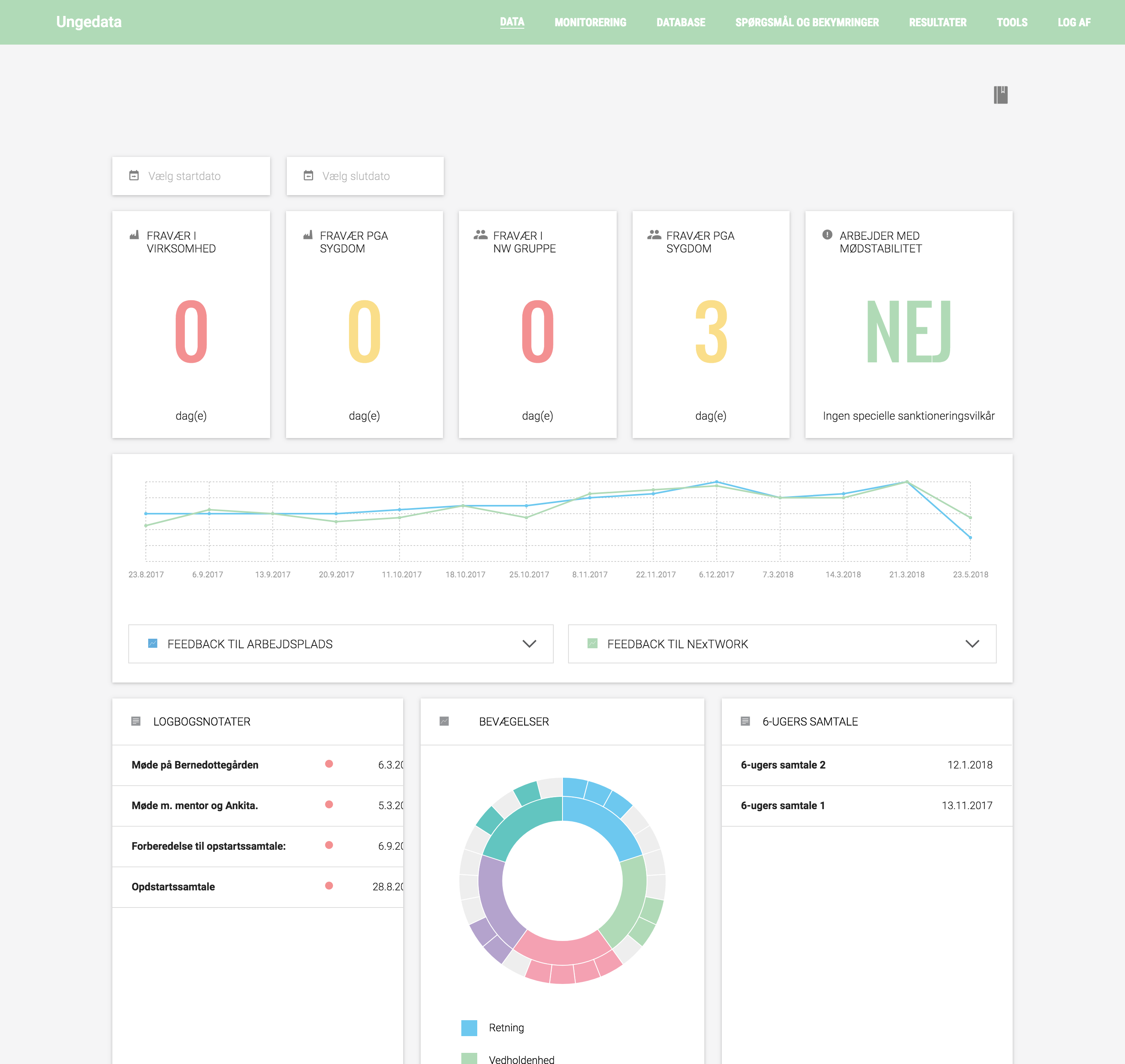
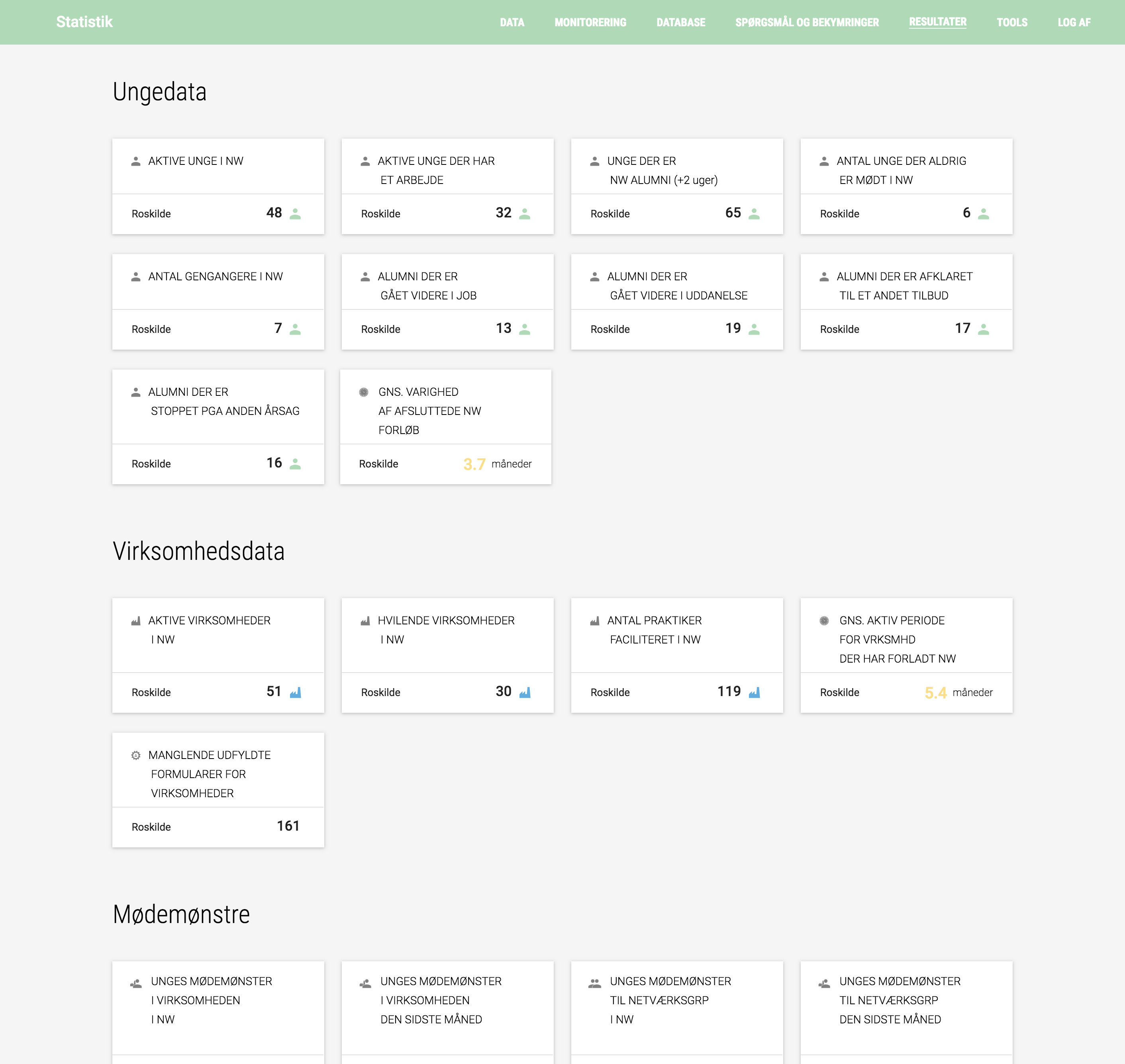
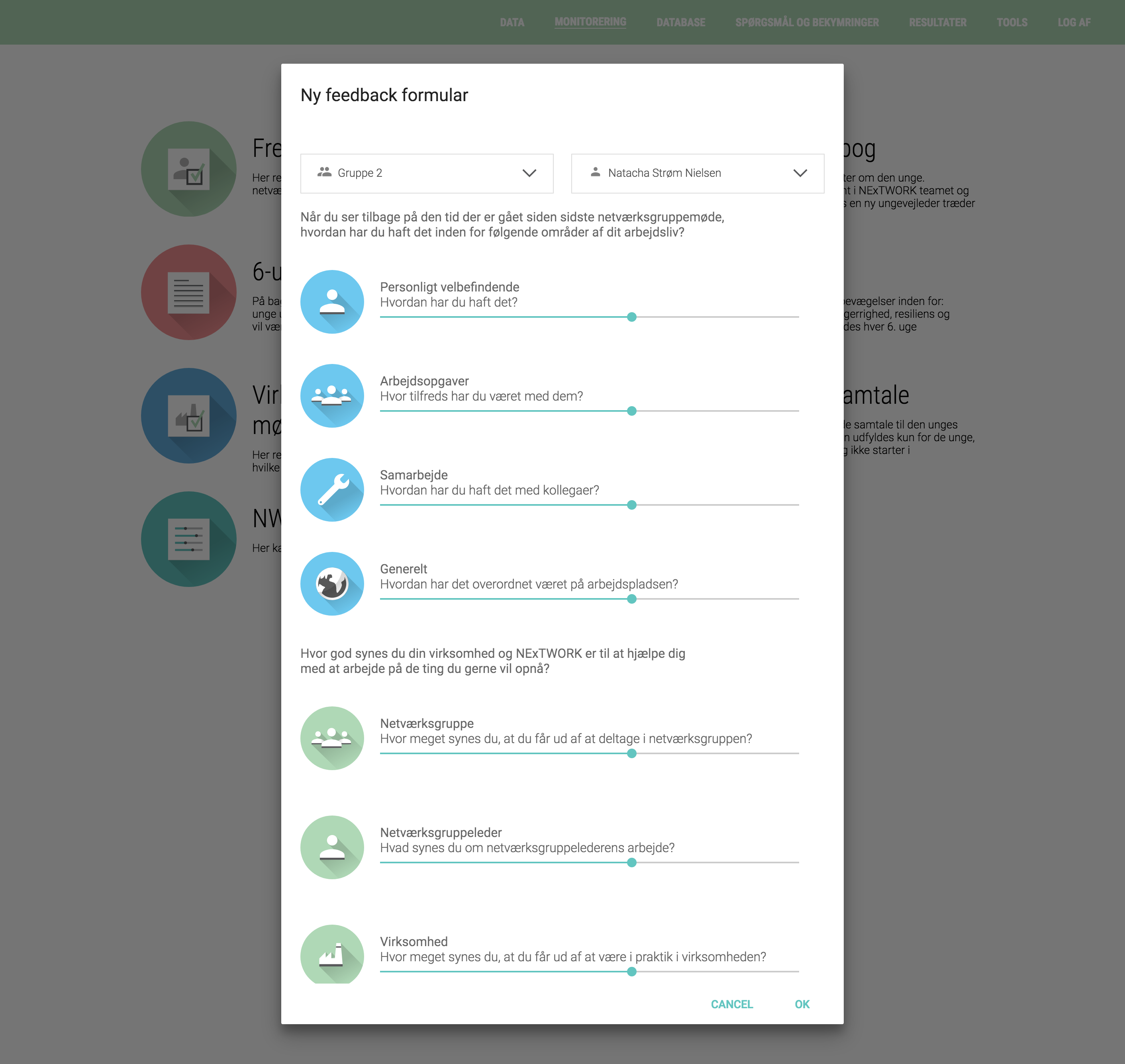
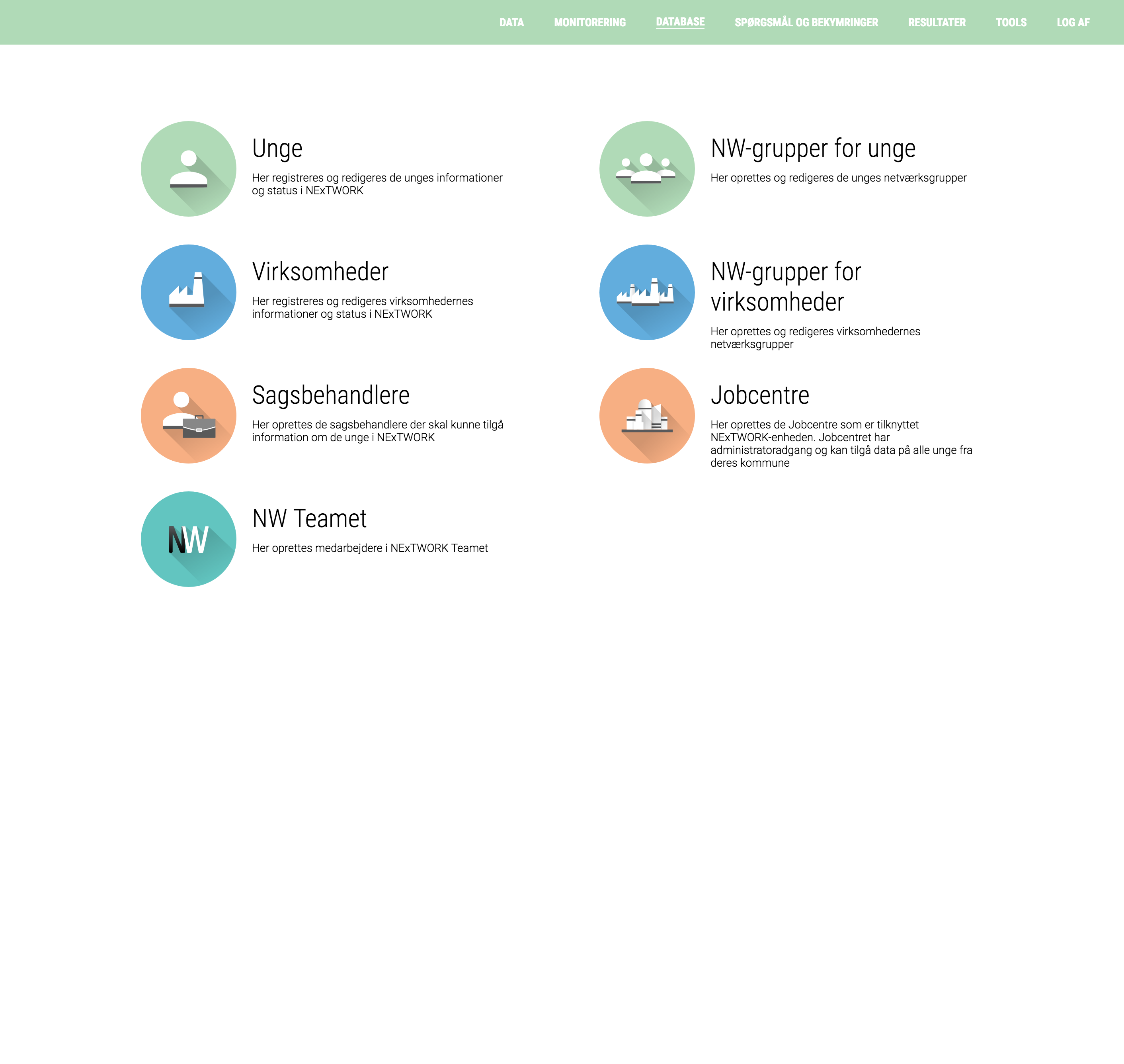
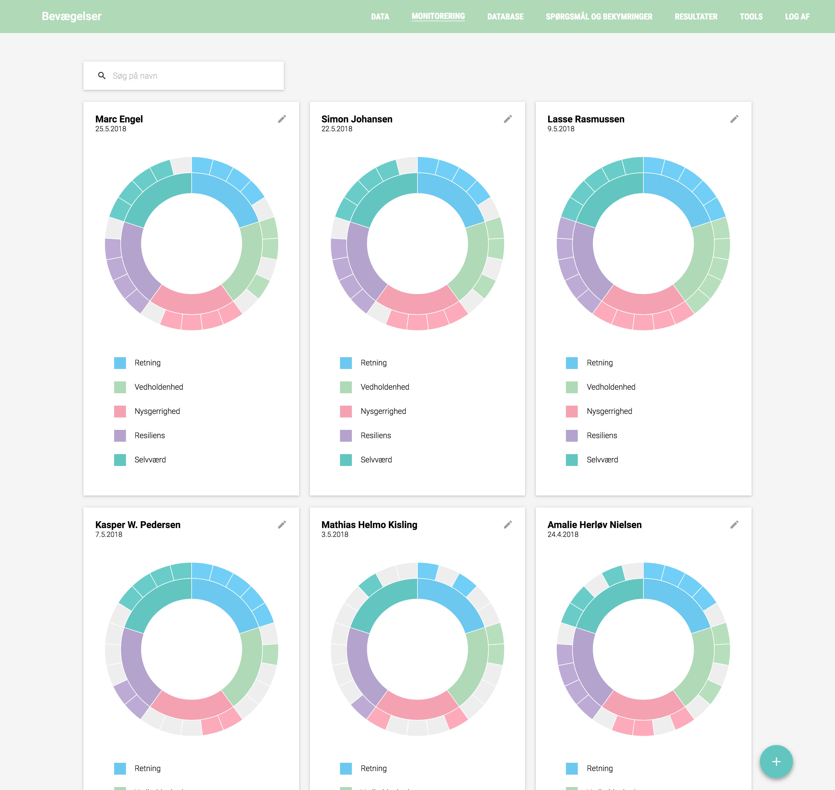
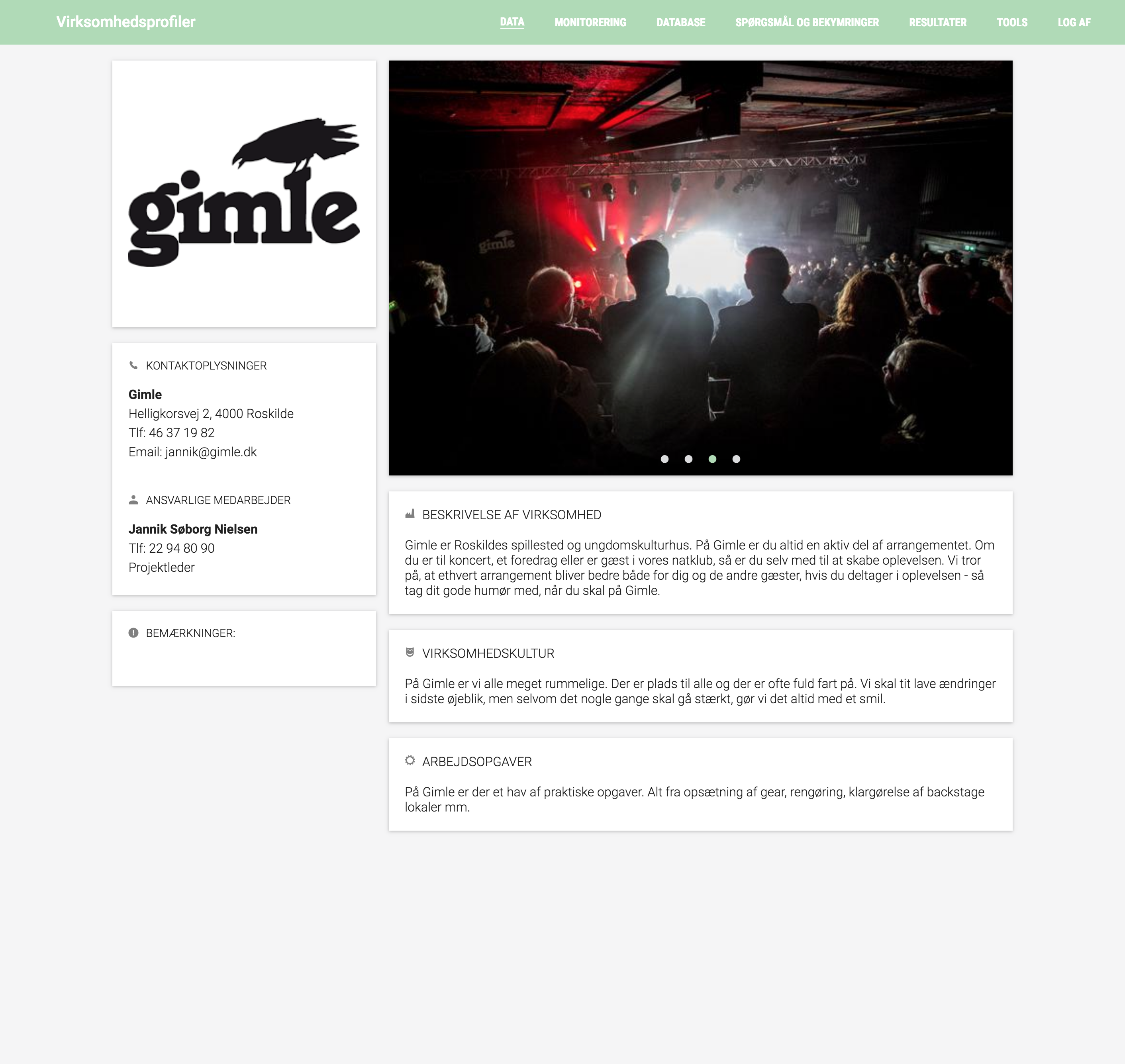
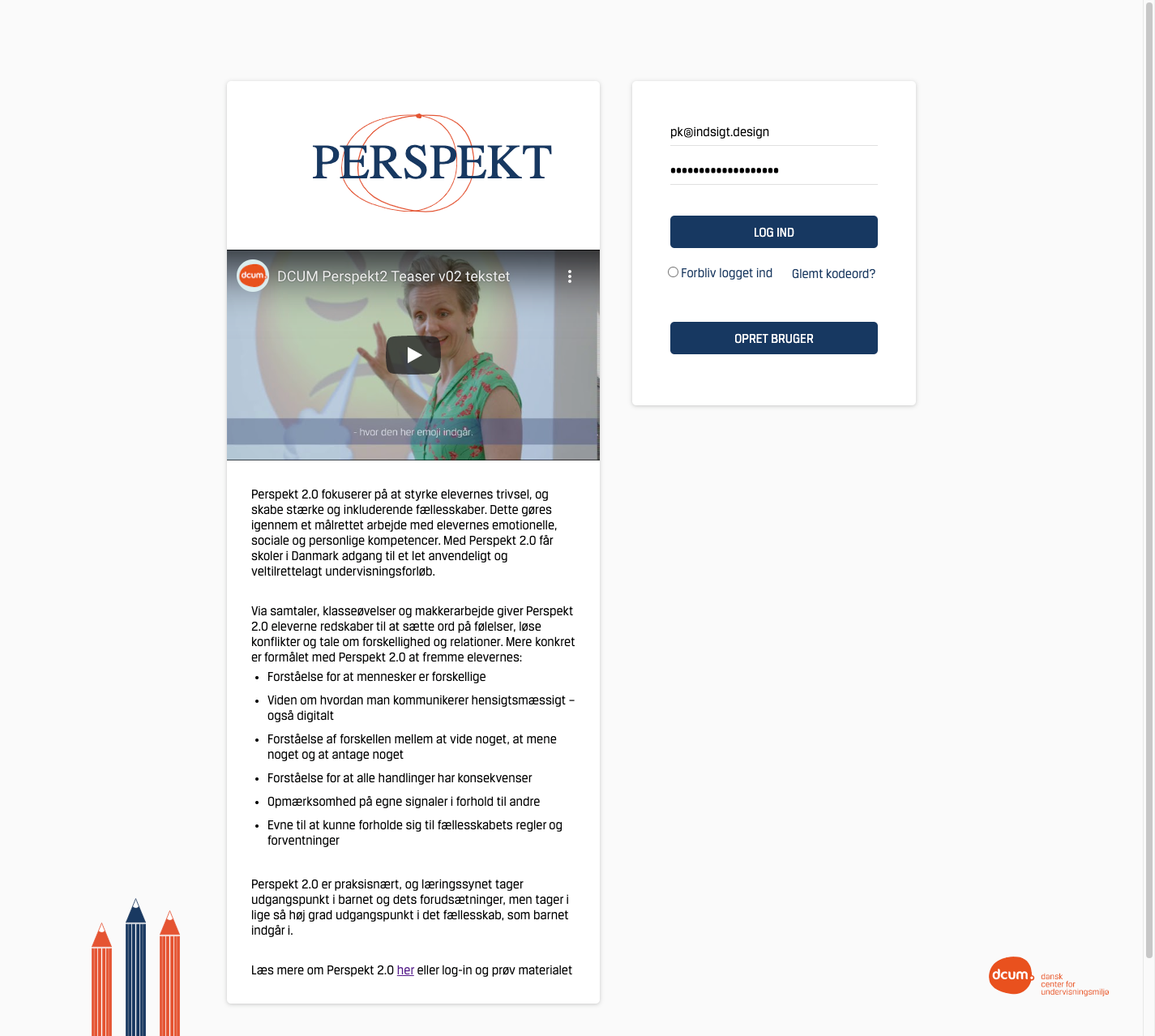
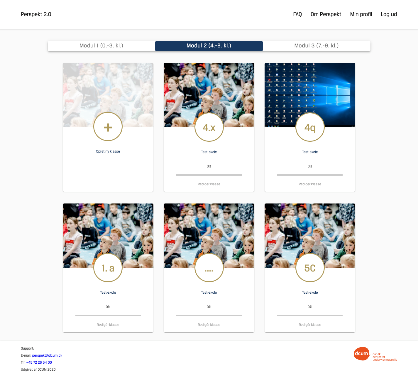
Perspekt 2.0
Dansk Center for Undervisningsmiljø
2020
Project Manager & Designer
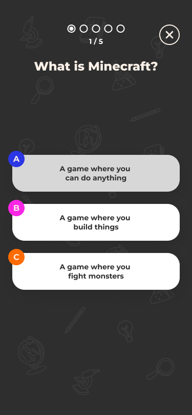
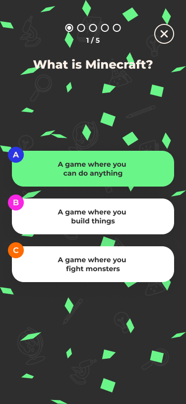
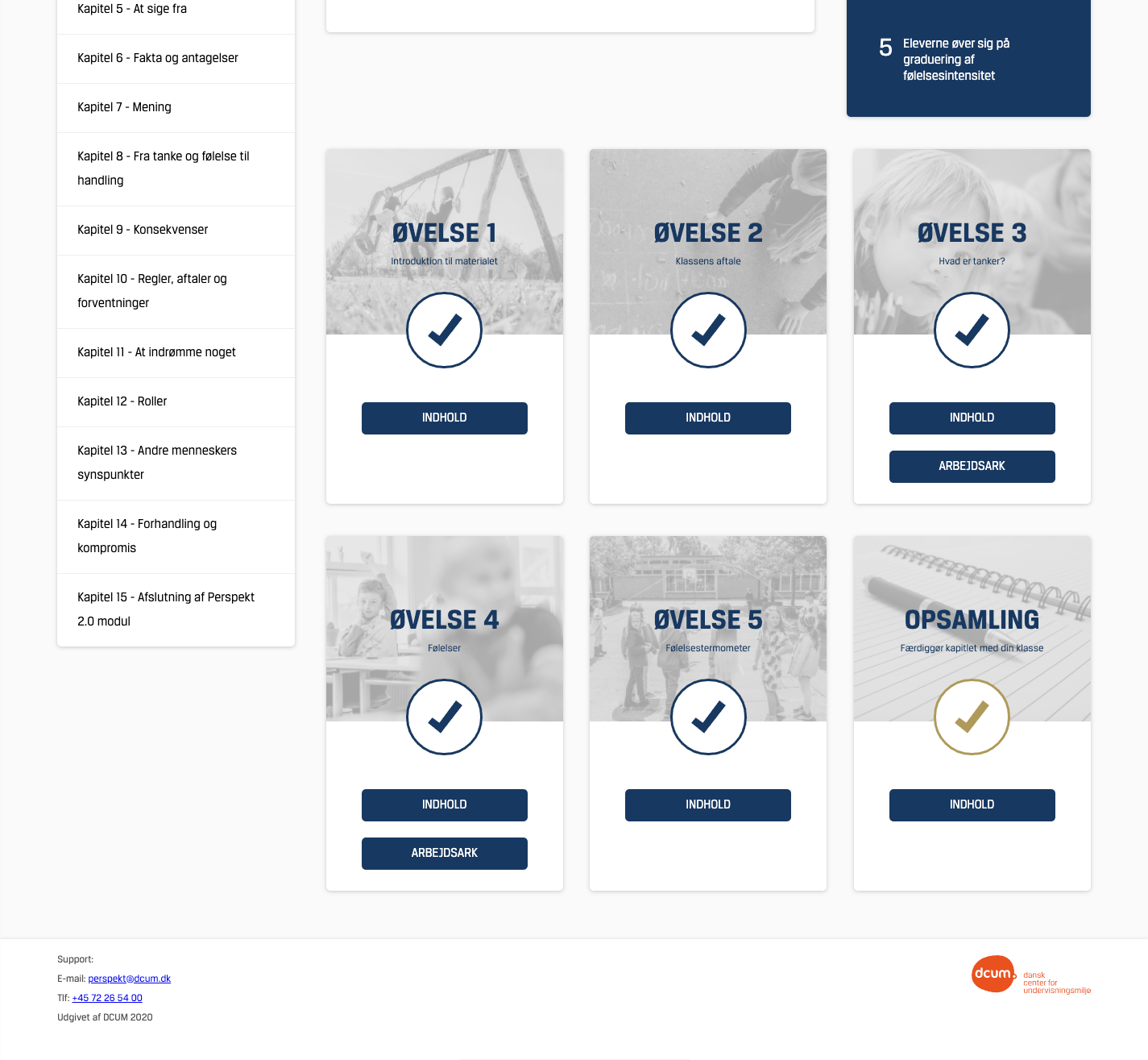
Perspekt 2.0 is a digital teaching platform developed for the Danish Center for Undervisningsmiljø to help primary school teachers deliver structured socio-emotional learning and track class wellbeing. It transforms comprehensive printed materials into an accessible web interface with three modules (early, middle and upper grades), each containing 15–16 lesson chapters complete with clear learning goals, exercises and worksheets. Piloted for a year with 70 schools in collaboration with Aarhus University and VIVE and officially launched in August 2024, it offers robust information design to make abundant content easily navigable and supports data-driven reflection on student social skills.
 (1).png)
 (2).png)
 (3).png)
Perspekt 2.0
Dansk Center for Undervisningsmiljø
2020
Project Manager & Designer
Perspekt 2.0 is a digital teaching platform developed for the Danish Center for Undervisningsmiljø to help primary school teachers deliver structured socio-emotional learning and track class wellbeing. It transforms comprehensive printed materials into an accessible web interface with three modules (early, middle and upper grades), each containing 15–16 lesson chapters complete with clear learning goals, exercises and worksheets. Piloted for a year with 70 schools in collaboration with Aarhus University and VIVE and officially launched in August 2024, it offers robust information design to make abundant content easily navigable and supports data-driven reflection on student social skills.
Future Erasure
CIID Research, University of Newcastle, Research Center for Material Culture
2018
Interface & Machine Design
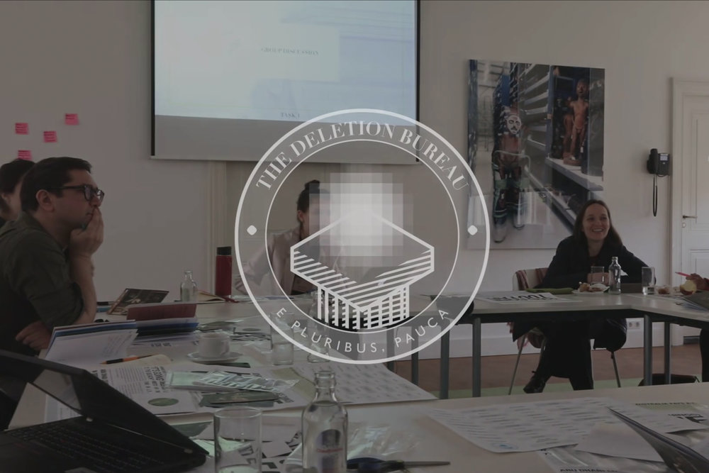
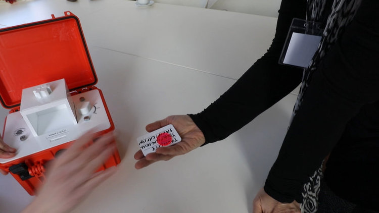
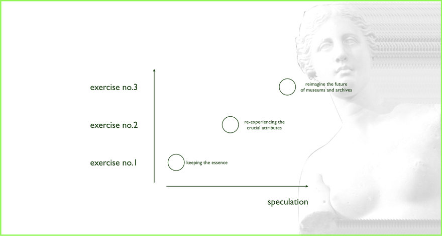
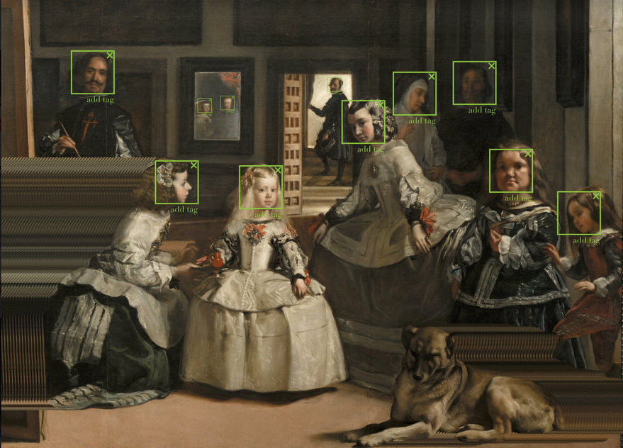
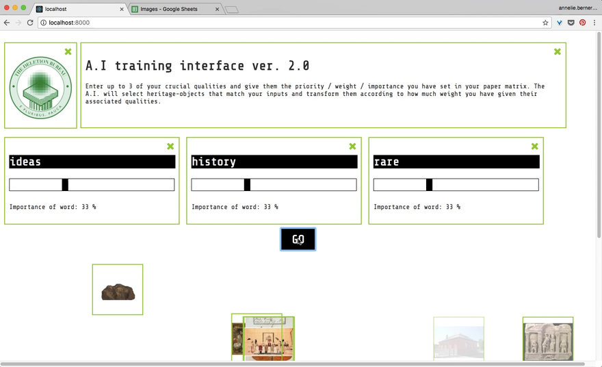
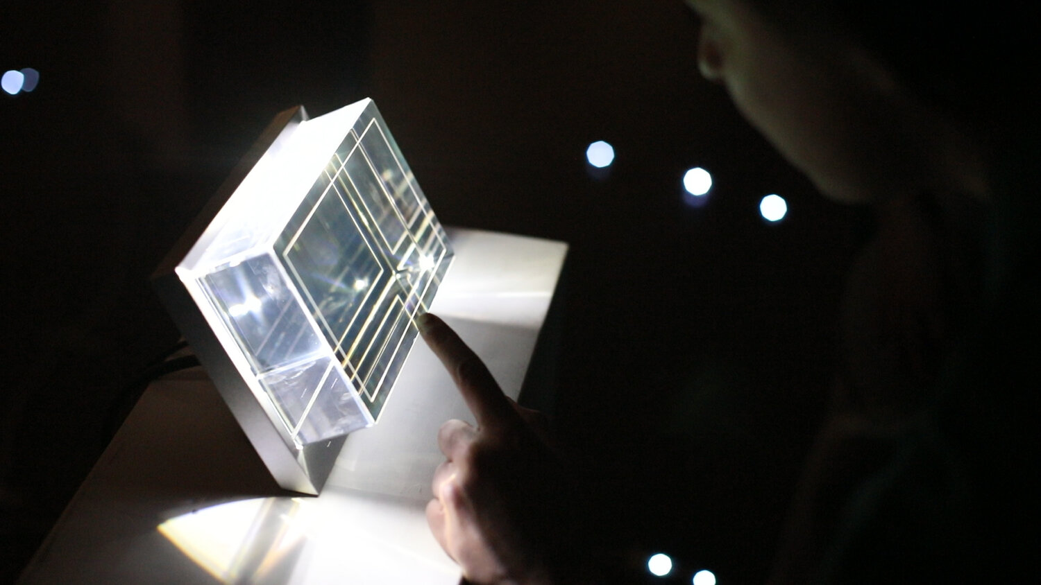
Future Erasure is a futurescaping workshop by CIID Research in collaboration with the University of Newcastle and the Research Center for Material Culture as part of the CoHERE project. Set in a scenario where museums must delete 20% of their collections each year, it uses speculative design and design fiction, newspapers, films, physical prototypes, and d3.js-driven interactive simulations, to immerse heritage experts in tasks like crafting deletion algorithms, prototyping devices for experiencing erased objects, and envisioning public interaction systems. The workshop provoked deep debate on institutional values and future visions for heritage preservation.
Awards:
Notable, Core77 Design Awards 2018 (Strategy & Research & Design Education Initiative)
Shortlisted, IxDA Awards 2019 (Disrupting)
Longlisted, Dazeen Awards 2019 (Future Erasure)

Future Erasure
CIID Research, University of Newcastle, Research Center for Material Culture
2018
Interface & Machine Design
Future Erasure is a futurescaping workshop by CIID Research in collaboration with the University of Newcastle and the Research Center for Material Culture as part of the CoHERE project. Set in a scenario where museums must delete 20% of their collections each year, it uses speculative design and design fiction, newspapers, films, physical prototypes, and d3.js-driven interactive simulations, to immerse heritage experts in tasks like crafting deletion algorithms, prototyping devices for experiencing erased objects, and envisioning public interaction systems. The workshop provoked deep debate on institutional values and future visions for heritage preservation.
Awards:
Notable, Core77 Design Awards 2018 (Strategy & Research & Design Education Initiative)
Shortlisted, IxDA Awards 2019 (Disrupting)
Longlisted, Dazeen Awards 2019 (Future Erasure)
Escaping the Strange Loop
EUROfusion consortium / CIID Research
2019
UX & Digital / Physical Prototype Developer
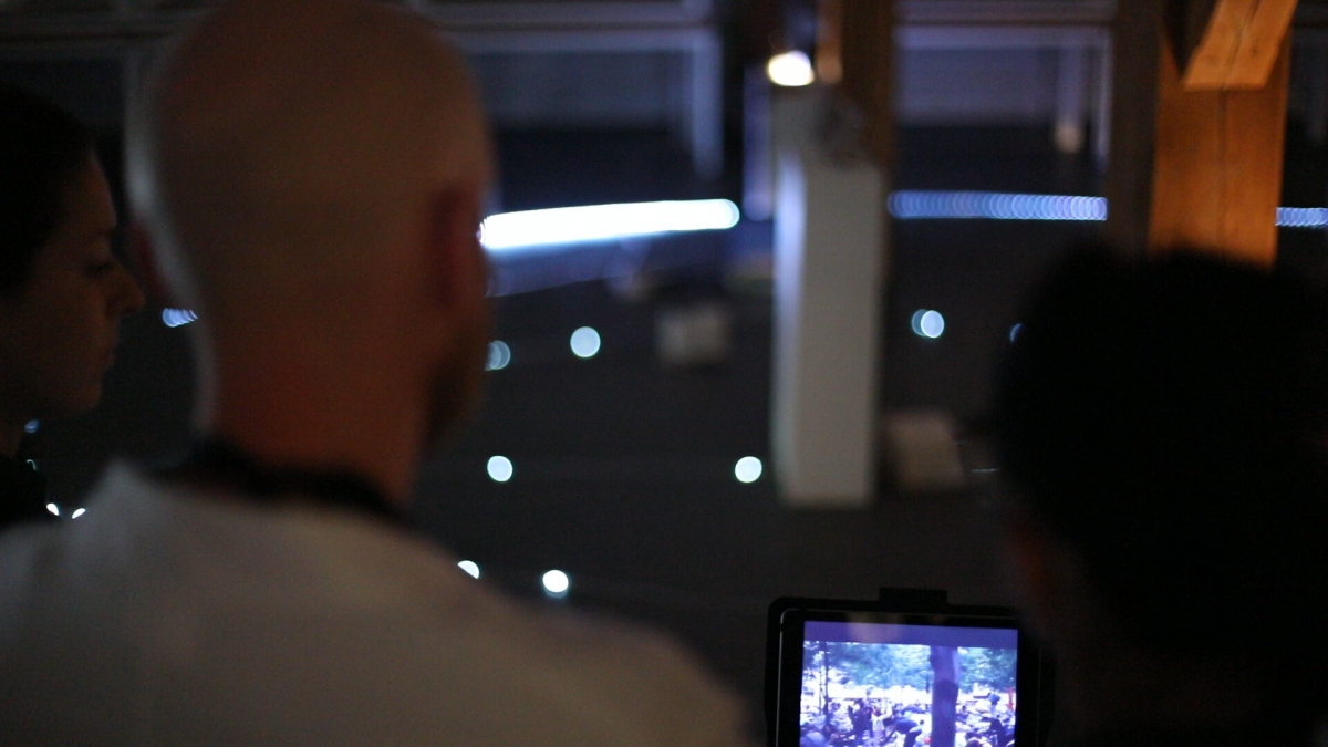
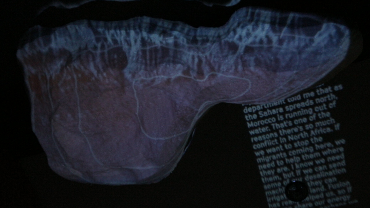
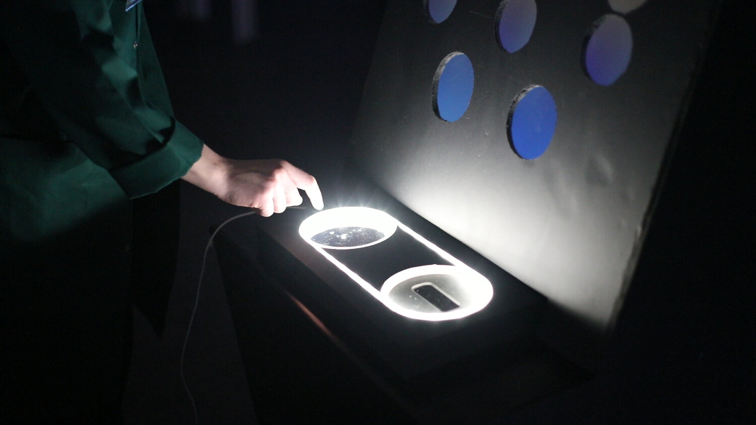
Escaping the Strange Loop is a participatory interactive installation by CIID Research in collaboration with the H2020 EUROfusion consortium that turns real energy-and-climate data into a game-like futurescape. Developed in 2018–2019, teams of three navigate a circular “loop” of missions set in 2050, 2080, and 2100, guided by the AI narrator GAIA. Using d3.js visualizations, Node.js logic, Arduino-driven consoles, video projections, and physical artefacts, participants make collective energy policy choices and witness their cumulative impact on a holographic planet finale bringing fusion and climate scenarios to life through embodied exploration.
Awards:
Runner-up, Speculative Design, Core77 Design Awards 2020
Notable, Strategy & Research, Core77 Design Awards 2020
Notable, Design for Social Impact, Core77 Design Awards 2020
Shortlisted, Optimizing, IxDA Interaction Awards 2020

Escaping the Strange Loop
EUROfusion consortium / CIID Research
2019
UX & Digital / Physical Prototype Developer
Escaping the Strange Loop is a participatory interactive installation by CIID Research in collaboration with the H2020 EUROfusion consortium that turns real energy-and-climate data into a game-like futurescape. Developed in 2018–2019, teams of three navigate a circular “loop” of missions set in 2050, 2080, and 2100, guided by the AI narrator GAIA. Using d3.js visualizations, Node.js logic, Arduino-driven consoles, video projections, and physical artefacts, participants make collective energy policy choices and witness their cumulative impact on a holographic planet finale bringing fusion and climate scenarios to life through embodied exploration.
Awards:
Runner-up, Speculative Design, Core77 Design Awards 2020
Notable, Strategy & Research, Core77 Design Awards 2020
Notable, Design for Social Impact, Core77 Design Awards 2020
Shortlisted, Optimizing, IxDA Interaction Awards 2020
